Preview image. Unlock full-res
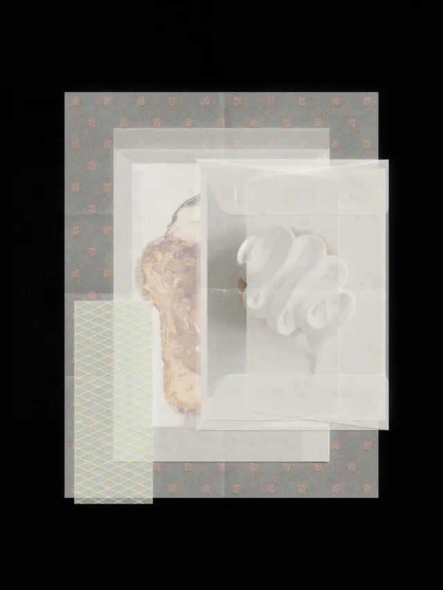
Spanish confectionery brand identity across six-piece carousel showcasing logo, typography, merchandise, and packaging design.

Summary
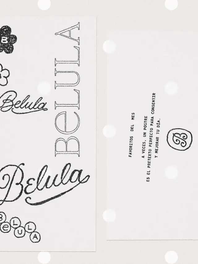
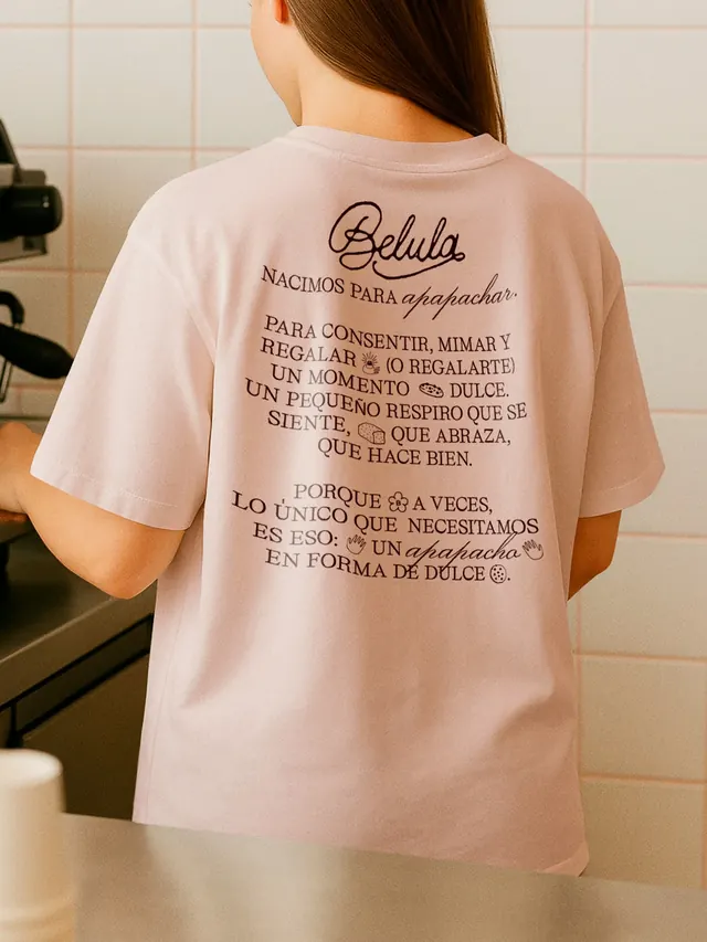
A complete brand identity for Belula, a Spanish pastry brand, spanning six slides of logo explorations, brand manifesto, merchandise, packaging, and lifestyle photography.
Visual description
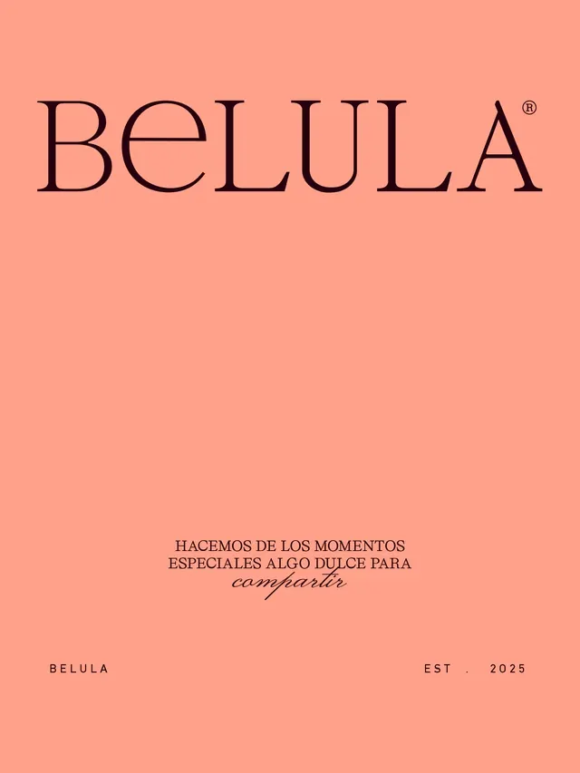
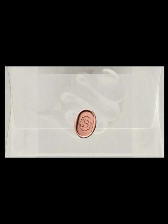
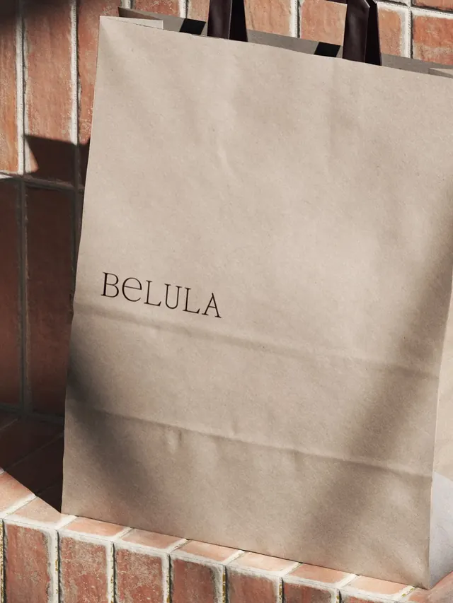
Slide 1: A cream page with hand-sketched logo variations and design notes for "Belula". Several circular flourish marks and a loopy script wordmark exploration in the corner. Slide 2: Beige background with overlapping translucent white rectangles creating depth, containing a tan-colored organic form and a white sculptural shape, suggesting a 3D composition study. Slide 3: A soft pink/blush t-shirt photographed from behind, with a long block of Spanish text printed on the back in small serif and sans-serif type, mixing italic and roman weights. The text describes the brand's philosophy about providing comfort and sweetness. Slide 4: A simple blush-pink background with the "BELULA" wordmark in serif font and tagline "HACEMOS DE LOS MOMENTOS ESPECIALES ALGO DULCE PARA compartir" (We make special moments something sweet to share) in mixed serif/sans-serif type. EST. 2025 in small caps. Slide 5: A minimalist flat-lay of a clear envelope or package with white quilted contents and a copper-colored wax seal with "B" engraved. Slide 6: A kraft paper shopping bag with "BELULA" printed in simple serif type, leaning against terracotta brick.
Key takeaway
Luxury positioning through elegant restraint: cream, blush, and copper palette; mix of handwritten and serif typography; and focus on tactile packaging and product presentation. The bilingual Spanish/design narrative ties brand values directly to product experience. Using materiality (wax seal, kraft paper, embossed logo) elevates a confectionery brand beyond commodity.
Reuse notes
Exemplary for food/beverage, retail, and consumer brand identity work, especially in luxury or artisanal positioning. The warm pastel color palette and handwritten + serif mix work well for brands targeting comfort, warmth, and premium craftsmanship. The carousel format (showing logo → manifesto → product → packaging) is a strong template for brand launches. Works across Spanish and international markets. Best paired with lifestyle and unboxing content.
From this post: Belula brand identity and packaging system
View post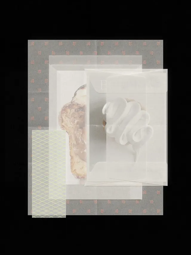
More like this
Keep what you find
A free account saves references to boards and can send you a weekly email of picks based on what you save.
To see every result, go Pro.