Preview image. Unlock full-res
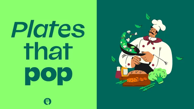
Two color split frame pairing a mixed italic and roman headline lockup on light green with a flat chef illustration on dark green.
More like this
See all

Summary
A hard vertical split that puts a three line headline on bright green against a flat chef illustration on bottle green, with the fork icon anchoring the type side.
Visual description
The frame divides slightly left of center. The left half is bright green carrying "Plates that pop" in dark teal across three lines, each line set differently: "Plates" in a light italic, "that" in a medium roman, "pop" in a heavy roman, all left aligned and tightly leaded so the words nest. The circular fork mark sits small and centered below the type. The right half is bottle green with a flat vector chef in white jacket, tall toque, moustache and maroon neckerchief tossing greens, mushrooms and chilli out of a black pan, with loose green leaves scattered into the surrounding space. Below him a wooden board carries bread, carrots, asparagus, broccoli, a bottle and a shaker. Linework is drawn with a soft textured pencil edge rather than clean vector strokes.
Key takeaway
Changing weight and slant line by line inside one short headline gives it a spoken cadence without needing a second typeface. The split also lets one composition serve both a light and a dark background treatment.
Reuse notes
A clean template for food and hospitality campaign frames, social banners and app onboarding art. The headline device needs a family with a genuine italic and a wide weight range. Keep the illustration side dark or the two halves lose their contrast.
More like this

Keep what you find
A free account saves references to boards and can send you a weekly email of picks based on what you save.
To see every result, go Pro.