Preview image. Unlock full-res
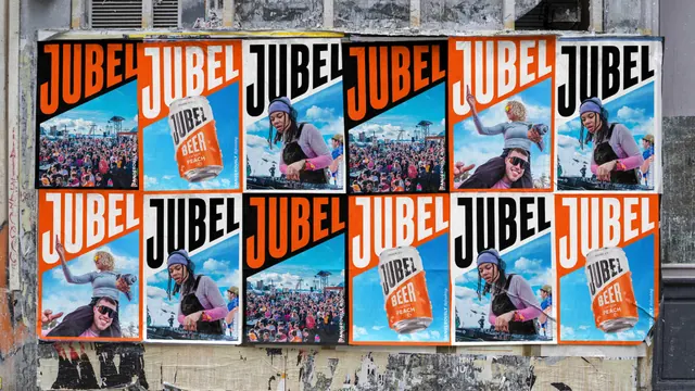
A grid of Jubel posters wheatpasted onto a street hoarding, each splitting a huge wordmark from a festival or snow photograph along the brand diagonal.
More like this
See all

Summary
The campaign at street scale: a dozen posters pasted in two rows where the same diagonal template is recoloured and re-photographed so the wall reads as one composition.
Visual description
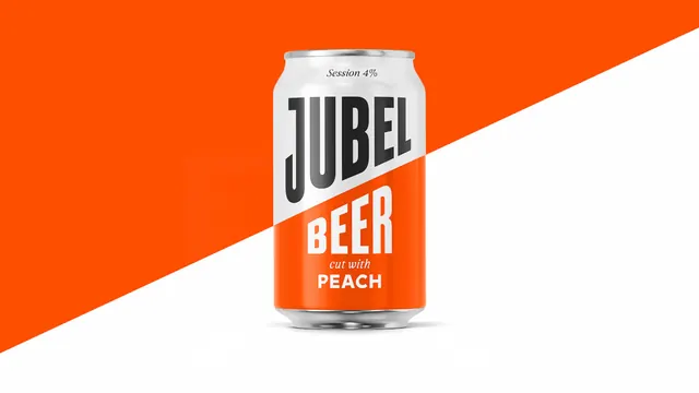
Posters are pasted flat onto a weathered hoarding, edges lifting and creased, with old torn paper visible below and grey render above. Each sheet uses the same layout: an oversized JUBEL in heavy condensed caps runs across the top, cut by a diagonal that hands the lower two thirds to a full-bleed photograph. Colorways rotate across the grid, orange type on black, white on orange, black on white, so no two neighbouring sheets match. The photographs cycle through three images, a dense festival crowd under a stage rig, a DJ in a purple beanie at the decks, and a woman in sunglasses raised on someone's shoulders holding a can, all shot under bright blue sky. A vertical DANGEROUSLY Refreshing line runs up the right edge of each poster in small type. Two sheets swap the photograph for a can floating against blue sky and cloud.
Key takeaway
One template, three photographs and three colorways multiply into a wall that looks bespoke. Setting the wordmark on the diagonal means adjacent posters create new angles against each other, which is what makes the flyposted block read as a single graphic rather than repetition.
Reuse notes
The pattern to reach for when a campaign will be posted in blocks rather than singly: design the tile, not the poster. It assumes access to real, energetic event photography and a wordmark strong enough to survive being cropped by a diagonal. Less effective as a single standalone poster, where the variation is lost.