Preview image. Unlock full-res
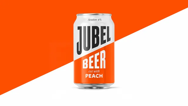
A single Jubel beer can shot centre frame against an orange and white diagonal split that continues the diagonal running across the can label.
More like this
See all
Summary
One can, centred, with the label's diagonal extended into the backdrop so the photograph and the packaging share a single continuous line.
Visual description
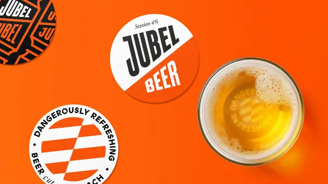
The frame is cut corner to corner by a diagonal: orange in the upper left, white in the lower right. The can sits dead centre, upright, with bright uncoated metal at the top and base. Its label carries the same diagonal at the same angle: a white upper field holding JUBEL in a very heavy condensed all-caps display face in near black, and an orange lower field holding BEER in the same condensed face reversed to white. A small italic serif line reads cut with above PEACH in bold sans caps. Across the shoulder of the can, an italic serif Session 4% sits small and centred. The letterforms are tall and narrow with flat terminals and a distinctive squared J that drops below the baseline.
Key takeaway
Aligning the backdrop split to the packaging split, so the can appears to sit inside its own graphic device rather than on top of a background. Two colors and one condensed typeface do the entire job.
Reuse notes
A clean reference for hero product shots in drinks, snacks, and any category where the pack already carries a strong geometric device. It only works when the can is shot perfectly straight on and the angles match exactly; a degree of drift breaks the illusion. Reserve for a single hero SKU, since the trick does not survive a multi-flavour lineup.