Preview image. Unlock full-res
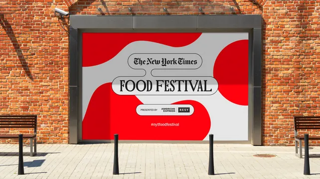
Red and white key visual with the masthead and event name in interlocking outlined pills, mounted in a metal frame on a brick wall.
More like this
See all
Summary
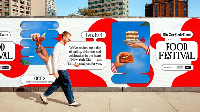
The stripped back version of the campaign: no photography, just red organic shapes under a stacked masthead and event name in thin outlined pills.
Visual description
A landscape panel sits inside a brushed metal frame on an orange red brick wall, with a security camera above and two benches and black bollards on the paved forecourt below. The artwork is light grey with two large soft edged red forms, one entering from the top left and one from the bottom, plus a red circle bleeding off the right edge. Centered on it are two interlocking outlined pills: the upper holds the blackletter newspaper masthead, the lower and wider holds "FOOD FESTIVAL" in a high contrast all caps serif, the two notched together so they share an edge. Below, a smaller outlined pill carries "PRESENTED BY" in condensed caps with two sponsor logos, one of them reversed white on a black block. Under that, a hashtag sits in plain white type directly on the red with no container. Everything is centered on a single vertical axis.
Key takeaway
The same pill system works with the photography removed entirely, which gives the campaign a quiet registration format for small or busy placements. Letting one element, the hashtag, sit outside a container stops the layout from feeling mechanical.
Reuse notes
Use as the reduced or endorsement lockup in a campaign that has a richer hero version elsewhere. The thin outline weight is the fragile part: at small sizes or on low resolution screens the pills fill in. Needs a light ground for the red shapes to read as shapes rather than as a background color.