Preview image. Unlock full-res
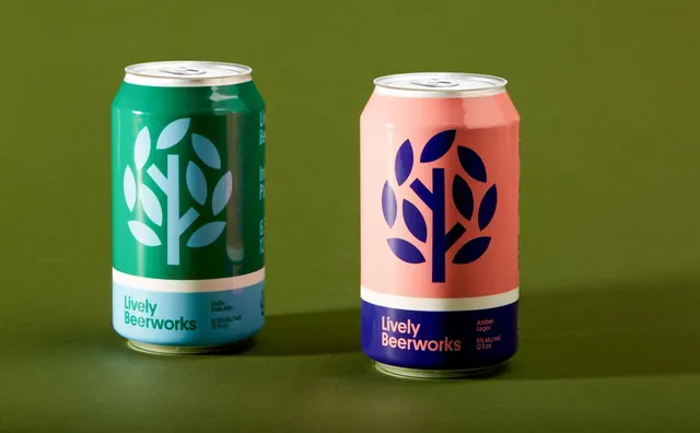
Two 12 oz cans side by side on an olive backdrop, one green with blue and one coral with navy, showing the flat tree mark and the range system.
More like this
See all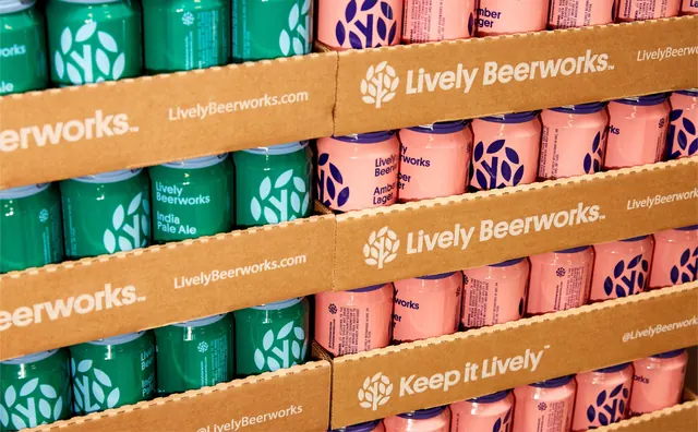

Summary
The clearest read of the packaging system, two cans from the range shot together on a flat olive ground so the shared structure and the swapped palettes are obvious at once.
Visual description
Two standard 12 fl oz aluminium cans stand upright and evenly spaced on a seamless olive green background, lit softly from the upper left with a short shadow pooling to the right of each. Both use the same layout. An upper field of roughly two thirds carries a large flat tree mark, a straight trunk with two branches and eight leaf shapes arranged in a loose circle, cropped so the outer leaves run close to the can edges. A narrow cream stripe divides that from a lower band holding Lively Beerworks on two lines at the left and a right hand stack of small type. The left can is deep green with a pale blue mark, a light blue base band, green type and the line India Pale Ale, 6.5% alc/vol, 12 fl oz. The right can is coral with a navy mark, a navy base band, coral type and the line Amber Lager, 5% alc/vol, 12 fl oz. Both lids are bare aluminium.
Key takeaway
One fixed structure plus a full colour inversion per product is enough to build a range, no illustration and no per beer artwork required. The olive ground is a third colour that flatters both palettes without belonging to either.
Reuse notes
The frame to reach for when arguing for a systematised beverage range over one off label art. Extending it means each new product needs a colour pair that holds contrast between mark and field, which gets harder past four or five variants. Pairs directly with the retail display and brewery frames from the same identity.