Preview image. Unlock full-res
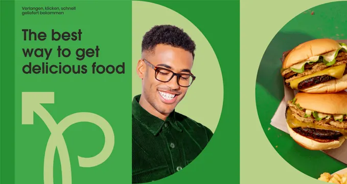
A wide green brand banner splitting headline, cut-out portrait and burger photography across three tonal panels.
More like this
See all
Summary
A landscape campaign layout in three shades of green where a circle mask is the only device holding the photography, and an oversized logo sits as a tonal watermark rather than a lockup.
Visual description
The left third is mid green and carries a two-line kicker in small dark sans reading Verlangen, klicken, schnell geliefert bekommen, then a four-line headline in heavy dark sans reading The best way to get delicious food. Below the headline the Pickt monogram is drawn very large in a pale green tint of the background, so it reads as texture rather than as a signature. The middle panel is pale green with a large circle in mid green, out of which a smiling man in a dark green corduroy shirt and tortoiseshell glasses is cut, his head breaking above the circle edge. The right panel repeats the device at a larger scale with a top-down photograph of two cheeseburgers on paper masked into a circle that runs off the right edge. All three panels are separated by hard vertical joins with no rules or gutters.
Key takeaway
One repeated shape, a circle in the panel's own tone, unifies wildly different imagery, portrait and product, into a single system. Dropping the mark to a tint of the background lets it appear at poster scale without competing with the headline.
Reuse notes
Reach for this when a brand needs one flexible campaign frame that can carry copy, people and product together, and when the palette is limited to tints of a single hue. It relies on subjects that cut out cleanly, so cluttered or low-contrast photography breaks the circle mask. The mixed-language treatment, local kicker over English headline, is worth noting before copying it verbatim.
More like this




Keep what you find
A free account saves references to boards and can send you a weekly email of picks based on what you save.
To see every result, go Pro.