Preview image. Unlock full-res
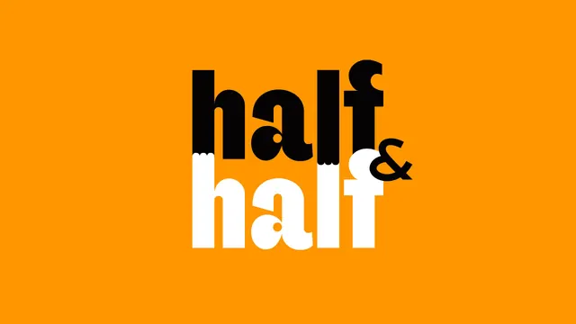
The stacked half and half wordmark shown large on flat orange, the top word black and the bottom word white with a torn seam where they meet.
More like this
See all
Summary
The core brand mark presented on its own, a two-line lowercase wordmark whose colour flips halfway down so the name is literally drawn in halves.
Visual description
A wide frame filled with flat saturated orange holds the lockup centred and large, occupying roughly the middle third. The word half is set twice in a heavy lowercase display sans with very tight fitting, high x-height, round bowls and a single-storey a. The upper instance is solid black, the lower instance solid white, and the two lines are locked together so tightly that the ascenders of the lower word push up into the black line above. Along that junction the shapes break into a short ragged tear rather than a clean rule. A small ampersand sits at the right where the two lines meet, reversed so its own halves invert against the letters around it. There is no tagline, no container and no shadow.
Key takeaway
Encoding the name in the construction, one half black and one half white split by a torn edge, means the mark explains itself without a symbol. The tight vertical interlock also makes it a compact block that survives on small pack panels.
Reuse notes
Works wherever a two-part name can be expressed as a literal division. It needs a mid-value brand colour behind it so both the black and the white halves hold, and it will not reverse cleanly onto photography. Reserve the full torn seam for large applications and simplify it at small sizes.