Preview image. Unlock full-res
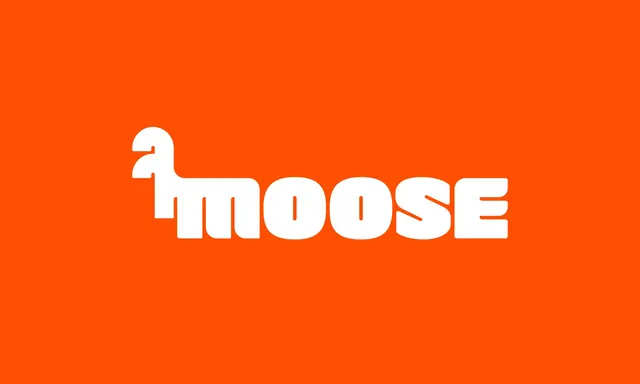
The Moose logotype presented large and centred on a flat orange field, its first letterform drawn as a four-legged animal.
More like this
See all
Summary
The primary Moose logotype shown clean and unaccompanied: heavy rounded white lettering on a saturated orange ground, with the opening character built into the head, neck and legs of an animal.
Visual description
A single flat orange field fills the frame with no texture, gradient or shadow. The word sits slightly left of true centre and reads as one continuous rounded mass, the letters nearly touching so the counters become thin slots rather than open bowls. The first form carries a rounded muzzle and a small notch for the eye, its neck dropping into a leg that lands on the same baseline as the rest of the word, which turns the mark into a creature standing on the word it spells. The double-storey shapes of the following letters read as body and haunches. Terminals are cut square where they meet, and the S carries a diagonal spine that breaks the otherwise fully rounded rhythm. Nothing else appears in the frame.
Key takeaway
Building the animal out of the first letterform rather than sitting a separate icon beside the word gives one indivisible asset that scales from a favicon to a billboard. The very tight letterspacing turns the whole word into a silhouette, which is what makes the creature legible at all.
Reuse notes
A strong model for consumer marketplaces or challenger brands that want warmth without a mascot illustration. Works because the word is short and the letterforms are fat, so the trick would not transfer to a long or thin-stroked name. Only tested here on a saturated ground, which the near-white gives enough contrast to survive.