Preview image. Unlock full-res
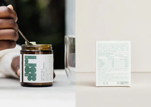
Two-panel product frame pairing a hand scooping green powder from a labelled amber jar with the monospace-set back panel of its carton.
More like this
See all
Summary
A two-panel product frame: a hand lifting a spoon of green powder out of an amber glass jar on the left, and the full back panel of the matching white carton on the right, both carrying the same green monospace label system.
Visual description
The left half is a soft-focus lifestyle shot. A hand holds a small spoon of pale green powder over an open amber glass jar that sits on a white surface, with a blurred glass tumbler behind it and dark green foliage falling out of focus in the background. The jar wears a white wraparound label: a large green geometric LBF monogram built from stacked bars and circles, the words LOVE, BEAUTY and FOODS reversed out of the bars, then INGESTIBLE WELLNESS POWDER and ALKALISING GREENS set vertically in narrow all-caps sans, a 65G / 2.29 OZ weight, and a block of tiny justified copy separated by hairline rules. The right half is a clean studio shot on a warm off-white seamless: a white carton photographed square-on, its back face filled with green monospace type. A justified product paragraph sits at the top, below it a ruled NUTRITION INFORMATION table with alternating hairline rows, then ingredients, directions and caution blocks, and at the base a storage line, two small compliance icons and a boxed Australian-origin mark. Everything is set flush and gridded, with generous margins and no imagery on the pack itself.
Key takeaway
The label does all its work with one geometric monogram plus a full page of monospace text on a hairline grid, so the pack reads as clinical and considered without a single decorative element. Pairing a warm, hand-held lifestyle shot with a cold, square-on back-panel shot in one frame sells both the ritual and the transparency of the ingredient list.
Reuse notes
A strong reference for wellness, supplement or apothecary packaging that wants to look evidence-led rather than spa-soft. The monospace nutrition table is the piece worth stealing for any pack with a lot of mandatory copy. Note that the type is set very small and justified, so it only survives at high print resolution and needs a generous label area to breathe.
More like this
Keep what you find
A free account saves references to boards and can send you a weekly email of picks based on what you save.
To see every result, go Pro.