Preview image. Unlock full-res
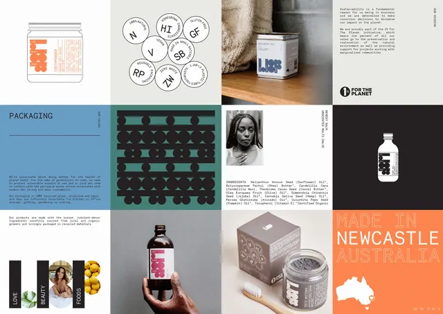
A twelve-tile grid laying out the whole LBF system at once, mixing line-drawn packs, badge icons, colour panels, product photography and mission copy.
More like this
See all
Summary
A twelve-panel board that shows the entire LBF identity in one frame, alternating flat graphic tiles with photography so the system reads as a single continuous surface.
Visual description
Four columns by three rows of equal tiles, edge to edge with no gutters. Top row: an outlined line drawing of a toothpowder jar with its label copy in orange; a cluster of nine white circular badges with two-letter abbreviations and ring-set captions such as 100% NATURAL, VEGAN, GLUTEN FREE and ZERO WASTE; a warm photograph of a wellness tea tin on a wooden shelf against knitted fabric; and an off-white mission panel with justified monospace copy, a vertical OUR MISSION label and the 1% For The Planet badge. Middle row: a cornflower blue panel headed PACKAGING with a rule and two paragraphs of values copy; a teal tile filled with a repeating black pattern built from the bar-and-circle monogram tiled into rows; a white tile holding a black-and-white portrait of a woman with braided hair, a vertical REMEDY BALM UNSCENTED MULTI-SALVE label and a full ingredients paragraph; and a near-black tile with an outlined bottle drawing reversed in white. Bottom row: a copy tile; a photograph of a hand holding an amber body oil bottle against grey; a photograph of a kraft carton, a jar of teeth whitener and a bamboo toothbrush; and an orange tile with MADE IN NEWCASTLE AUSTRALIA in large outlined display caps above a white Australia silhouette with a heart and a coordinate line. A fourth tile at bottom left splits into black name bars interleaved with small photographs of leaves, a bather and lemons.
Key takeaway
Every tile is the same size and the same rhythm, so flat vector drawings, dense copy blocks and photography can sit side by side without any of them dominating. Reversing the same monogram into a repeat pattern on one tile gives the system a surface graphic for free.
Reuse notes
An efficient template for a case study opener or a brand board that has to prove range in a single image. Works best when the palette stays to two or three accent colours so the grid reads as one system rather than a moodboard. The outlined pack drawings need to be redrawn per product, which is a real cost if the range is large.
More like this


Keep what you find
A free account saves references to boards and can send you a weekly email of picks based on what you save.
To see every result, go Pro.