Preview image. Unlock full-res
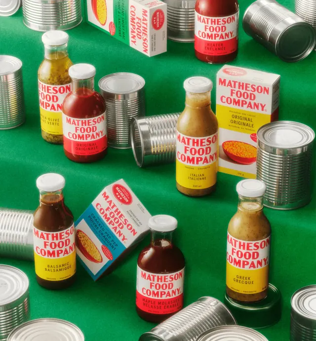
Overhead group shot of the branded sauce and pasta range interspersed with plain silver tin cans across a saturated green ground.
More like this
See all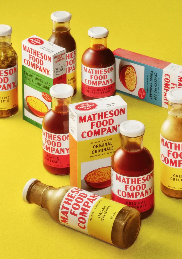
Summary
The product range photographed on a strong green ground with unbranded silver tin cans dropped between the items, so the labelled goods read as the only colored things in a pantry of anonymous metal.
Visual description
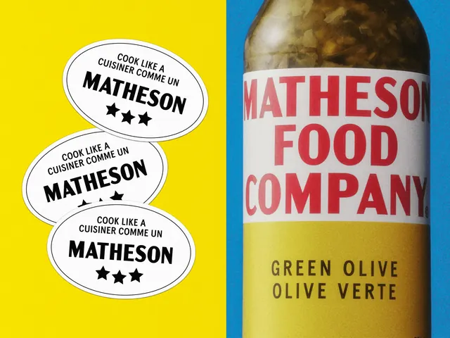
Dressings, BBQ sauces and mac and cheese cartons are spread across a saturated green seamless in a loose scatter, seen from a high angle. Flavor bands name "GREEN OLIVE / OLIVE VERTE", "ORIGINAL / ORIGINALE", "BALSAMIC / BALSAMIQUE", "MAPLE MOLASSES / MELASSE ERABLE", "GREEK / GRECQUE", "ITALIAN / ITALIENNE" and "HEATER / ENFLAMEE", each under the same white panel of red condensed caps. Cartons show the red oval "COOK LIKE A / CUISINER COMME UN MATHESON" seal with three stars and a photographic window of pasta in a red bowl. Between and behind them, plain ribbed tin cans stand upright, lie on their sides and stack in groups, catching hard specular highlights. Several cans are cropped by the frame edges, extending the scatter past the image.
Key takeaway
Surrounding branded packs with deliberately blank objects makes the identity's color and type do the separating, which is a cleaner argument for shelf standout than a shelf shot of real competitors. The green ground pushes the reds forward without any of the labels containing green.
Reuse notes
Use when a packaging case study needs to show standout rather than just range. The unbranded filler has to be genuinely neutral in form; anything with its own graphics reintroduces noise. High-angle scatter shots like this crop badly to square or vertical, so plan a separate frame for social.