Preview image. Unlock full-res
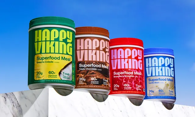
Four flavour tubs balanced along a white marble ledge shot from below against a clear blue sky.
More like this
See all

Summary
A low-angle range shot of four superfood shake tubs overhanging the edge of a white marble slab, with a gradient blue sky as the only backdrop.
Visual description
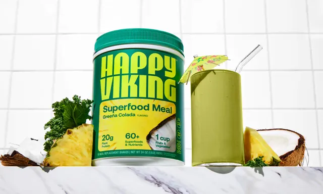
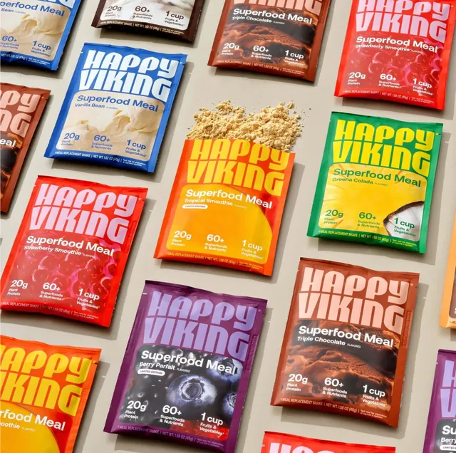
The four tubs step down in scale from left to right, each pushed most of the way off the ledge so its base hangs in the air and casts a small shadow back onto the stone. Colours are deep forest green, milk chocolate brown, fire engine red and cobalt blue, each with a matching screw cap and a thin white collar between cap and body. The "HAPPY VIKING" wordmark occupies the top half of every label in the brand's heavy geometric sans, stacked over two tight lines with fine horizontal seams cutting the strokes, and printed in a lighter tone of the tub colour: chartreuse on green, dusty pink on brown, hot pink on red, pale blue on blue. Under it, "Superfood Meal" is set in white with the flavour beneath, "Greeña Colada", "Triple Chocolate", "Strawberry Smoothie" and "Vanilla Bean". The lower half of each label is a full-bleed macro of the flavour, pineapple and coconut, chocolate ice cream, raspberries and vanilla cream, overlaid with the same three stat blocks and a footer rule reading "15 MEAL REPLACEMENT SHAKES | NET WT 24 OZ (1.5LB) 680G". Small certification roundels including a B Corp mark run down the right edge of each label. The sky graduates from mid blue at the top to a paler blue behind the marble, and the slab is cropped hard at the bottom of the frame.
Key takeaway
Cantilevering the packs off the ledge gives the range shot movement and depth without any prop styling, and the plain sky makes four saturated colours sit together without clashing. The tonal wordmark trick from the sachets carries across formats, which is what makes the family read as one system.
Reuse notes
A strong template for hero imagery on a product listing or campaign page where the range needs to feel outdoor and active rather than clinical. Works best with an even number of SKUs and strongly differentiated cap colours. The blue sky ties the shot to a summer or performance context, so it will not carry a year-round evergreen page on its own.