Preview image. Unlock full-res
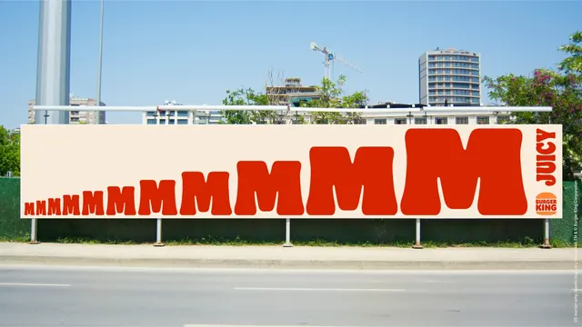
Roadside billboard where a row of red Ms grows from tiny to full height across the panel before landing on the word JUICY and the bun logo.
More like this
See all
Summary
An out-of-home mockup that uses one repeated letter at growing scale as the entire headline, turning a long horizontal panel into a crescendo.
Visual description
A wide cream billboard is mounted on white posts along a fence at the edge of a road, photographed straight on. Across the panel, the letter M repeats about fourteen times in flat red, starting tiny at the far left and growing steadily until the final Ms are cut off by the top and bottom edges of the board. All sit on a shared baseline so the row rises like a ramp. At the right end, the word JUICY is set vertically in red capitals reading bottom to top, with the orange and red bun logo directly beneath it. Behind the board are apartment blocks, a construction crane, trees with pink blossom and clear blue sky; below it are grass, a kerb and an empty asphalt road with white lane markings. A thin legal line runs vertically at the right edge.
Key takeaway
Scaling one repeated letter across the full width converts the awkward proportions of a long billboard into the message itself, and rotating the single payoff word vertically at the end gives the eye a stopping point. The board stays cream and red only, so it reads at driving speed.
Reuse notes
Reach for this when a format is extremely wide and a conventional headline would be lost, or for campaign work where the copy is a sound rather than a sentence. The idea depends on a distinctive letterform and on being read left to right at speed; it would not survive a square or portrait crop.