Preview image. Unlock full-res
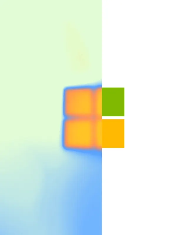
Portrait logo study splitting the frame vertically so one half of a four-square mark dissolves into a soft gradient while the other stays sharp.
More like this
See all

Summary
A tall frame cut down the middle: the left half is a diffused pastel wash with a softly bloomed four-square mark, the right half is flat white with the same mark rendered as two hard-edged colour blocks.
Visual description
The image is portrait, roughly four to five. A vertical seam at the halfway point divides two treatments. Left of the seam, a haze of pale mint green at the top graduates into powder blue at the bottom, with faint noise in the upper area. Floating at the vertical centre, just left of the seam, sits half of a four-pane square mark rendered entirely out of focus: two orange and amber panes glowing inside a soft blue halo, edges bleeding several pixels wide. Right of the seam the background is pure white, and the mark's other two panes continue as perfectly crisp flat rectangles, olive green above and saturated amber below, aligned exactly to the blurred halves so the whole mark reads as one object photographed through two different lenses. No typography, no lockup, no captions. The frame carries no words at all.
Key takeaway
Splitting a single mark between a defocused and a sharp rendering is a compact way to say resolution, clarity, or something coming into focus without writing any copy. Aligning the two halves pixel-perfect at the seam is what keeps it reading as one mark rather than two graphics.
Reuse notes
Useful for a security, imaging or detection brand that wants an abstract key visual derived from its own mark rather than stock imagery. The effect depends on a mark made of separable geometric parts, so it will not transfer to a one-piece wordmark or a detailed pictorial logo. Portrait crop suits app splash screens, story-format social and poster placements.