Preview image. Unlock full-res
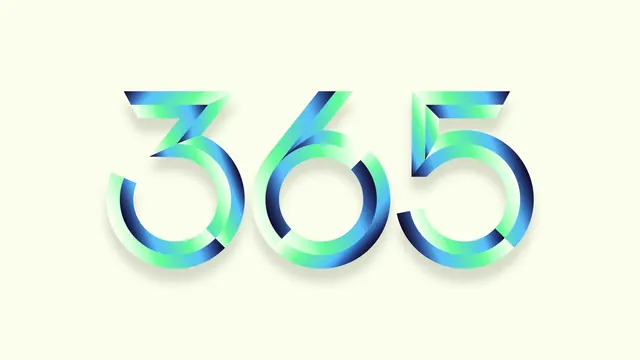
The "365" numerals blown up across a pale cream field, each stroke shaded with a grainy mint-to-navy gradient that makes the forms read as folded ribbon.
More like this
See all
Summary
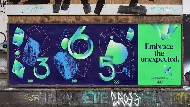
The numeral half of the logotype shown at poster scale, with a grainy gradient running along each stroke so flat geometric forms appear to twist and catch light.
Visual description
A wide frame with a pale cream ground and nothing on it but the numerals "365", centered and filling most of the width. The forms are geometric and monoline with circular bowls, open counters and flat angled terminals: the 3 and the 5 both break their upper strokes into straight diagonal blades that overlap the round lower bowls, and the 6 crosses its diagonal over its ring. Every stroke carries a gradient that runs from near white through mint green and cyan blue into deep navy, with visible grain and noise in the transitions. The gradient direction changes at each junction, so the overlaps read as folded facets rather than flat crossings. A soft drop shadow in a warm grey sits under the whole logotype, lifting it slightly off the ground.
Key takeaway
Gradient direction, not outline, is what builds the dimension here. Shifting the ramp at every stroke junction turns a flat monoline numeral set into something that reads as folded ribbon, and the added grain keeps the gradients from looking like default vector blends.
Reuse notes
A good pattern for a brand detail slide, an animation still or a large format application where the full lockup would be too busy. The effect needs the letter shapes to have overlaps to shade; on a plain sans it would do nothing. Test the grain at small sizes and in print, since fine noise over a light background can band or drop out.