Preview image. Unlock full-res
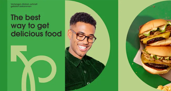
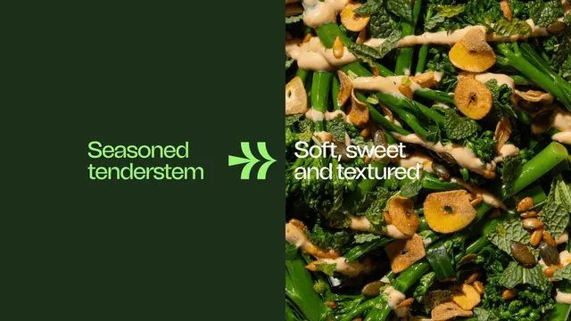
A dark green type panel meets a full-bleed food close-up, with the chevron mark used as an arrow bridging the two halves.
More like this
See all
Summary
A landscape frame cut vertically into a flat dark green half and a photographic half, with the brand mark placed on the seam so it reads as an arrow pushing one phrase into the other.
Visual description
The left roughly half of the frame is a solid deep forest green carrying the words "Seasoned tenderstem" in two lines of bright acid green geometric sans, positioned just below centre. Immediately to its right, straddling the vertical edge, sits the chevron mark in the same acid green at headline scale. The right half is a full-bleed overhead photograph of dressed tenderstem broccoli with mint leaves, toasted garlic slices, pumpkin and sunflower seeds and a pale drizzled dressing, lit hard so the stems glisten. Over the photograph, aligned to the same baseline as the left phrase, the words "Soft, sweet and textured" run in two lines of white sans. The type is left aligned on both sides and no other element appears.
Key takeaway
Reusing the identity mark as functional punctuation: because the mark already points right, it turns a plain split layout into an input-to-outcome statement. Matching the baselines across the seam keeps the two halves reading as one line.
Reuse notes
Good for product benefit slides, trade decks and paid social where a raw ingredient has to be linked to a finished claim. It depends on the mark being directional; a symmetrical logo will not carry the same meaning. Keep the white copy over the darkest part of the food photograph or it will lose legibility.