Preview image. Unlock full-res
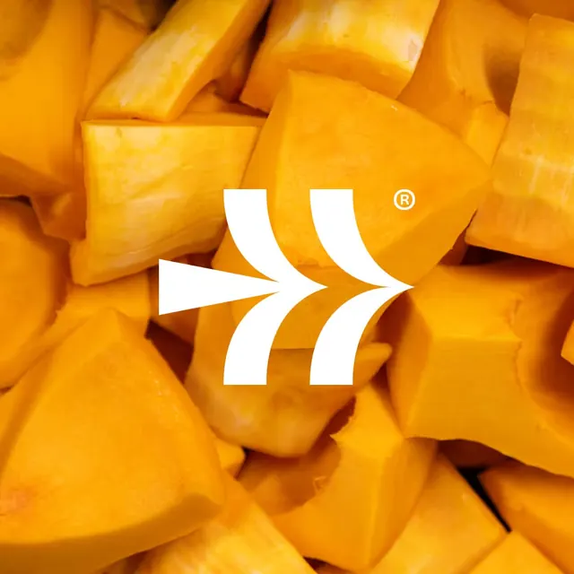
The chevron mark reversed to white and centred over a full-bleed close-up of diced butternut squash.
More like this
See all

Summary
A single brand application: the identity mark reversed out in white and set large over a tightly cropped photograph of raw squash.
Visual description
The whole square frame is filled with roughly cut chunks of butternut squash, shot from above and close enough that individual cubes span a fifth of the width. The palette runs from pale cream flesh at the cut faces through to deep saturated orange, with the shadows between pieces reading almost brown. Centred over it, the chevron mark sits in solid white: the tapering wedge on the left, then the two pairs of curved bands converging on a point at the right. A small white circled R sits above and right of the apex. There is no wordmark, no panel behind the mark and no other graphic element; the mark simply lies on the photograph and stays legible because the squash tones never approach white.
Key takeaway
Reversing the mark straight onto product photography with no containing shape or scrim, and choosing a crop whose value range stops well short of white so the knockout holds. The mark's open counters let the food read through it.
Reuse notes
A clean pattern for packaging faces, social tiles and ingredient dividers. It only works over imagery with a controlled tonal range; a shot with specular highlights would break the white mark. Scale the mark so its counters stay wider than the produce texture underneath, otherwise the silhouette dissolves.