Preview image. Unlock full-res
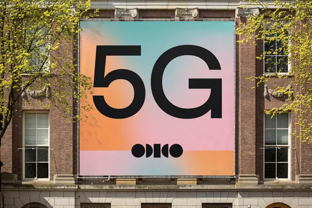
A huge square banner hung across a heritage brick facade, carrying an oversized 5G in black over a soft blurred gradient with the geometric wordmark below.
More like this
See all
Summary
A single oversized product claim rendered as a giant black 5G floating on a soft multi-hue gradient, tensioned as a square banner between the pilasters of an old brick building.
Visual description
The banner fills the bay between two stone-capped pilasters, laced to a metal frame at top and bottom so the fabric edge scallops slightly. Its ground is a wide blurred gradient blending teal at the top, warm orange down the left, pastel pink through the middle and pale periwinkle at the right, with a horizontal band across the lower quarter where the same hues repeat in a different order. Centered on it, the characters 5 and G are set enormous in a near-black geometric sans with very even stroke weight and a tight aperture, the 5 slightly smaller than the G. Below the numerals sits the wordmark, built from solid black circles and half-circles that read as letters through counter shapes rather than conventional strokes. Brick piers, white sash windows, carved stone ornament and the yellow-green leaves of a young tree frame the banner on both sides.
Key takeaway
A single two-character claim at maximum scale on a painterly gradient makes a telecom message feel like art rather than advertising. Building the wordmark from pure geometric primitives means it holds up at banner scale and stays legible as a small black stamp beneath much larger type.
Reuse notes
Reach for this when one product claim has to dominate a large architectural surface and there is no room for supporting copy. The gradient needs to stay soft and low contrast, otherwise the black type loses its edge. Works especially well against ornate or historic buildings where the flat modern surface reads as a deliberate contrast.