Preview image. Unlock full-res
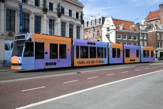
A full tram wrapped in a lilac to orange gradient with the black dot logo and a greeting headline, photographed in traffic on a canal-side street.
More like this
See all
Summary
An articulated city tram wrapped end to end in a soft lilac to orange gradient, carrying the black circular Odido mark twice and a single conversational line of copy along the lower body.
Visual description
The tram runs across the lower two thirds of the frame in three-quarter view, shot from the opposite pavement on a sunny day. Its wrap is a continuous blend that shifts from lilac through pink to a saturated orange, with the orange concentrated on the nose, the roofline of the first car and one middle segment so the gradient reads as light moving along the vehicle. The logo, a row of solid black circles and half circles that resolve into the word, sits at the same height on the first and third cars. Across the second car, set in a bold lowercase sans-serif in black and aligned to the bottom of the window band, is a single sentence of Dutch greeting copy. Behind the tram are a white neoclassical facade with statues and a row of brick canal houses under a blue sky; in front, brick paving and asphalt with a white lane line fill the bottom third and are left almost entirely empty.
Key takeaway
The gradient is applied to the whole vehicle as one continuous field rather than per-carriage, so the articulated joints stop reading as breaks and the tram becomes a single moving brand object. Keeping every element black on that gradient means the mark and the copy stay legible wherever the blend happens to land.
Reuse notes
A good reference for stretching a soft gradient across a long, jointed, window-heavy surface without losing the mark. Works when the identity has a high-contrast monochrome logo that can sit anywhere on the blend; a colored logo would fight it. Note that the photograph gives the wrap a lot of quiet foreground pavement, which is what lets a mid-tone gradient read as bright.