Preview image. Unlock full-res
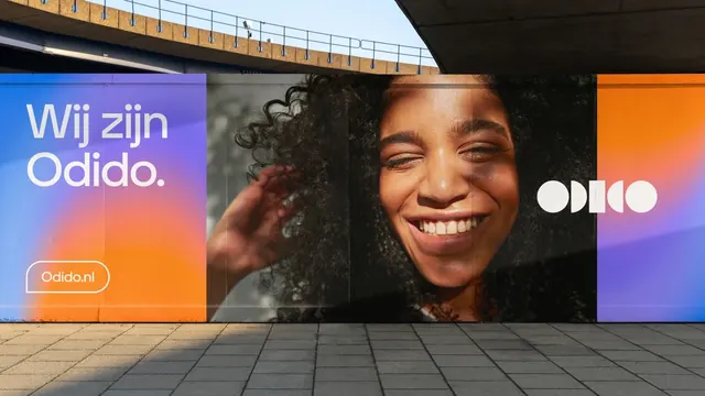
A long hoarding wrap split into three panels, a gradient copy panel then a full-height smiling portrait then a gradient panel carrying the geometric wordmark.
More like this
See all
Summary
A construction hoarding running the full width of the frame, treating the brand as three stacked-width panels where a blurred blue-to-orange gradient bookends a single black and white portrait.
Visual description
The left panel is a soft mesh gradient moving from blue at the top through violet to a strong orange at the lower left. On it, a two-line greeting sits in white in a soft geometric sans with a period after the brand name, and below it a pill-shaped outlined button holds the web address. The center panel is a large photograph of a woman with voluminous curly hair laughing with her eyes closed, one hand raised near her cheek, lit so the background falls to near black; the image is desaturated relative to the panels either side. The right panel returns to the gradient, now running orange at the left into violet and blue, carrying the wordmark in white circles and half-circles at its center. Panel seams and faint reflections run vertically through the wrap. A concrete overpass and its railing cut across the top of the photograph, and grey paving slabs with a raking shadow fill the foreground.
Key takeaway
Alternating gradient panels with one high-contrast photograph gives a very long horizontal format a rhythm instead of a single stretched image. Repeating the gradient on both ends and mirroring its color order makes the wall read as one continuous brand surface even when only part of it is in view.
Reuse notes
A practical answer for hoardings, fences and other extreme-width sites where a poster crop would fail. It relies on a portrait that survives desaturation between two saturated panels, so casting and lighting matter more than the copy. Keep the copy panel and mark panel at opposite ends so the brand is captured from either walking direction.