Preview image. Unlock full-res
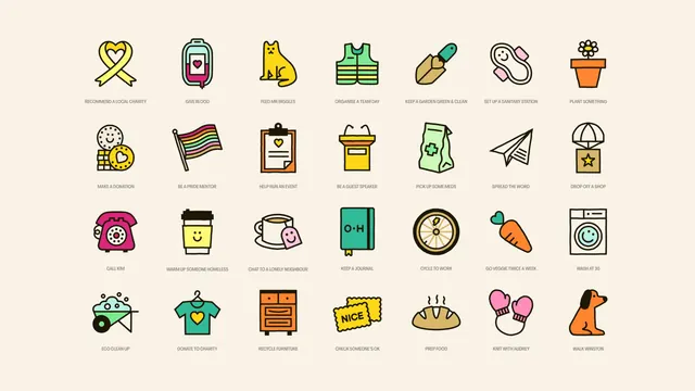
A twenty-eight icon set of everyday good deeds drawn in heavy black outlines with flat colour fills, laid out on a cream grid with small caps captions.
More like this
See all

Summary
A full icon system shown as a specimen sheet: twenty-eight illustrated icons in a four-row, seven-column grid, each captioned with the action it represents.
Visual description
Cream background, generous margins, and even gutters. Every icon is drawn with a uniform heavy black stroke and filled with flat colour, no gradients and no shading. The palette runs across yellow, orange, mint, teal, magenta, pale pink and tan, with several icons left as outline only on the cream. Subjects are concrete everyday actions: an awareness ribbon looped into a heart, a blood bag with a phone screen, a seated cat, a hi-vis vest, a trowel, a potted daisy, a rainbow flag, a clipboard, a paper plane, a parachuted box, a rotary telephone, a takeaway cup with a smiling face, a teacup, a notebook stamped O H, a bicycle wheel with a lightning bolt, a carrot with a heart top, a washing machine with a smiling drum, a wheelbarrow, a hanger with a heart tee, a chest of drawers, tickets reading NICE, a loaf of bread, mittens, and a dog. Under each icon sits a short caption in small grey all-caps sans: RECOMMEND A LOCAL CHARITY, GIVE BLOOD, FEED MR BIGGLES, ORGANISE A TEAM DAY, and so on. Several icons carry small smiling faces worked into the object itself.
Key takeaway
One stroke weight and one flat-fill rule applied across twenty-eight very different subjects is what makes the set read as a system rather than a collection. Naming the icons with specific, human copy (FEED MR BIGGLES, CALL KIM, WALK WINSTON) does more for the brand voice than the drawings do on their own.
Reuse notes
Useful as a reference for building a large action or category icon library for an app with many task types, and as a template for how to present one: grid, uniform sizing, caption under every icon. The heavy outline style needs a warm off-white ground to sit on; on pure white it would feel harsher. Captions in grey at this size are decorative more than legible, so plan a larger caption treatment for real product use.
More like this



Keep what you find
A free account saves references to boards and can send you a weekly email of picks based on what you save.
To see every result, go Pro.