Preview image. Unlock full-res
Logo animation where geometric fragments rotate and slide together into the lowercase Ortto wordmark on a flat electric blue field.
More like this
See all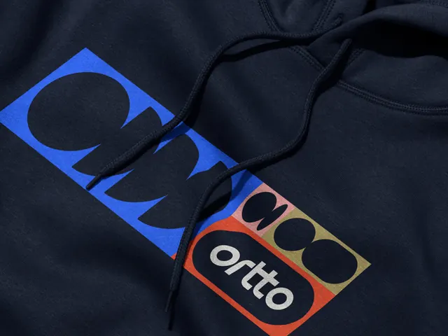
Summary
A wordmark reveal on flat electric blue where the letters of "ortto" arrive as loose geometric parts, arcs, bars and quarter circles, then lock into a finished lowercase logotype.
Visual description
The field is a single saturated blue with no gradient, texture or margin graphics. The wordmark sits centred and near black. Early in the loop only faint outline ghosts of the letters are present, then solid pieces begin to appear: partial rings for the o forms, straight stems for the t forms, small quarter arcs that will become terminals. Fragments rotate into position and close their gaps, so the two t forms fill in from the crossbar outward and the final o closes last from an open C shape. The letterforms are a geometric sans with circular bowls, flat cut terminals and generous counters, spaced widely enough that each letter reads as its own object during the build. By the end of the loop the mark is complete and static, a clean black "ortto" on blue with no tagline or supporting text.
Key takeaway
The build is derived from the letterforms themselves rather than added on, so every moving piece is a real part of the final logo. Holding one flat colour and one mark for the whole loop makes the construction the only thing to watch.
Reuse notes
A dependable model for a logo sting on social, a site loader or a video end card. It only works with geometric letterforms that decompose into circles and bars, so a humanist or serif wordmark would need a different approach. Pairs with the wider shape language and colour system in the rest of this identity.