Preview image. Unlock full-res
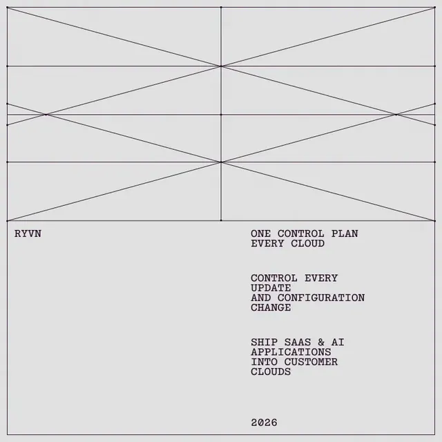
A monotype brand identity exploration for RYVN featuring precise geometric line constructions, intricate arc patterns, and monospace typography across a restrained light grey palette.
More like this
See all
Summary
A monotype brand identity exploration for RYVN featuring precise geometric line constructions, intricate arc patterns, and monospace typography across a restrained light grey palette.
Visual description
A square light-gray panel framed by a thin dark plum keyline. The top half holds a pure line construction: a vertical center axis, horizontal guides, and crossing diagonals meeting at small node dots. Below it, all-caps monospaced type is set in a left-aligned wordmark and a right-hand column of short stacked statements with generous blank lines between them and a year at the bottom.
Key takeaway
Turn the construction lines themselves into the hero graphic, with dots at every intersection, and let monospaced all-caps text hang off a single column below. A one-ink palette on flat gray keeps the whole system feeling engineered.
Reuse notes
Reach for this as a identity system reference. Pairs with typographic, geometric directions. Original by Ayush Soni.
More like this



Keep what you find
A free account saves references to boards and can send you a weekly email of picks based on what you save.
To see every result, go Pro.