Preview image. Unlock full-res
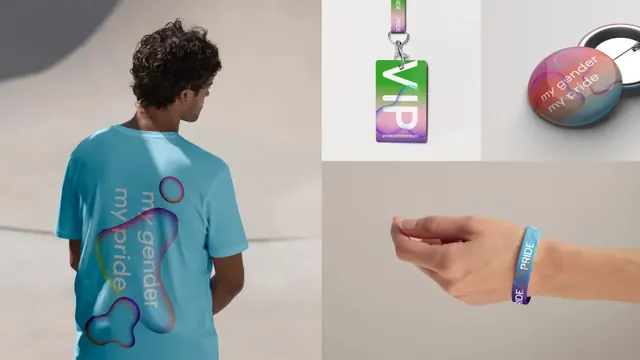
Four-panel merchandise composite showing the gradient blob identity on a t-shirt back, a VIP lanyard card, a pin badge and a festival wristband.
More like this
See all
Summary
One composite frame split into four unequal panels, each showing the same blob and gradient language applied to a different physical festival item.
Visual description
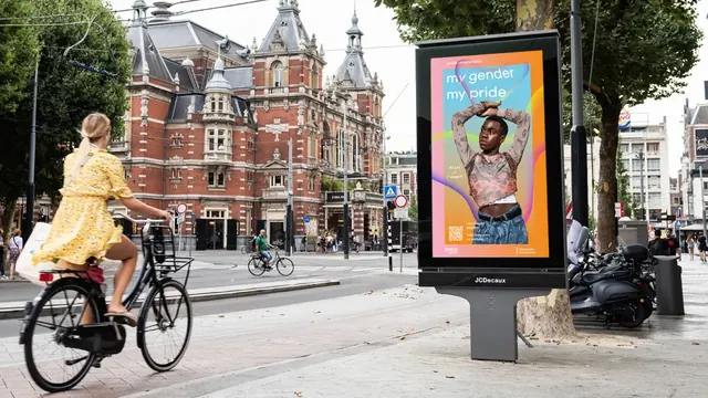
The image is divided into a tall left panel and three panels on the right. Left: a man with dark curly hair, seen from behind against a pale grey studio wall, wearing a light blue t-shirt. Across the back sits a large soft-edged organic blob shading from blue through green to orange, with the words my gender / my pride set inside it in white rounded sans, rotated so the lines run down the garment. A smaller detached blob floats above and another below. Top center: a vertical VIP accreditation card hanging from a printed lanyard, the card carrying a green-to-lilac gradient with a very large VIP set in white and cropped by the card edges, and pride.amsterdam in small type at the foot; the lanyard webbing repeats the word PRIDE. Top right: a round pin badge lying on a pale surface, its face a pink-to-blue gradient blob with my gender / my pride in white, the metal back visible behind it. Lower right: a forearm and closed hand against a warm grey backdrop, wearing a woven festival wristband in blue and purple with PRIDE repeated along its length.
Key takeaway
Showing four items at four different scales in one frame proves the blob can be the whole graphic on a t-shirt back and shrink to a single repeated word on a wristband. Cropping the blob so it runs off the edge of each object keeps the shape feeling continuous across items rather than placed like a logo.
Reuse notes
A tidy pattern for presenting an event or festival merchandise range in a single slide instead of four. The panel proportions do the work: give the hero garment the tall panel and let the small accreditation items share the rest. Worth copying for any identity where the core asset is a shape rather than a mark, since it demonstrates scalability without a usage-rules page.