Preview image. Unlock full-res
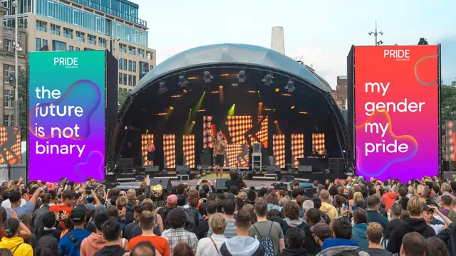
A packed open-air stage flanked by two tall LED screens carrying gradient slogan frames reading the future is not binary and my gender my pride.
More like this
See all
Summary
The identity at event scale: two portrait LED walls either side of a live stage, each holding a single slogan set inside soft gradient blobs.
Visual description
Daylight photograph of a city square packed with a dense crowd shot from behind, facing a wide domed stage truss hung with par cans and moving lights. A performer in a patterned shirt and black shorts stands center stage with a microphone, a second performer to the left, a camera operator at the stage lip and orange pixel-pattern content on the stage backdrop screens. Flanking the stage are two tall portrait LED walls mounted on black scaffolding. The left screen carries a gradient running teal at the top into deep purple at the base, with the words the future / is not / binary set in large white rounded sans across three lines, a blue-to-orange blob passing behind the word future and a smaller blob near the foot; the Pride Amsterdam mark sits small at the top center. The right screen runs a red-to-purple gradient with the Pride Amsterdam mark at the top, my gender / my pride in white across three lines, an iridescent circle top right and a large orange-edged blob below the copy. A third partial screen is visible at the far left edge showing the same orange pattern as the stage. Sky is overcast, office and hotel buildings frame the square.
Key takeaway
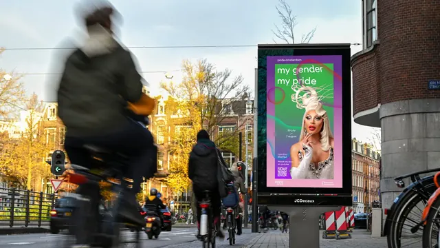
Reserving each screen for one short line of copy on one gradient means the identity still reads from the back of a crowd, where any denser layout would collapse. The blobs, sized differently on each screen, keep two side-by-side frames from looking like a duplicated template.
Reuse notes
Good reference for how to spec festival or conference LED content: one statement per surface, type large enough to survive distance and camera compression, and color chosen to separate from stage lighting. Worth pairing with the flag and poster frames of the same system to show one language across print, street and screen. Note the screens compete with warm stage lighting, so cool gradients hold up better here than warm ones.
More like this
Keep what you find
A free account saves references to boards and can send you a weekly email of picks based on what you save.
To see every result, go Pro.