Preview image. Unlock full-res
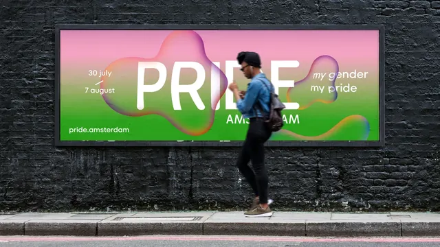
A wide billboard on a black brick wall running a pink-to-green gradient with an oversized PRIDE wordmark partly obscured by floating iridescent blobs.
More like this
See all
Summary
A horizontal billboard where the headline word is deliberately half-swallowed by translucent gradient blobs, proving the identity reads even when broken up.
Visual description
The photograph shows a long black painted brick wall behind a pavement, with a framed landscape billboard mounted on it and a person in a denim jacket and beanie walking past in the foreground. The poster itself runs a vertical gradient from hot pink at the top through to bright green at the bottom. Centered across it is the word PRIDE in very large white sans-serif, with AMSTERDAM set smaller directly beneath the last three letters. Three large soft organic blobs, edged with iridescent orange, purple and blue, float over the field: one on the left that swallows the P and R, one on the right, and one trailing off the bottom right corner. Where a blob crosses the letterforms the white type dims and tints rather than disappearing. On the left, in small white type, sit the dates 30 july and 7 august separated by a short diagonal rule, with pride.amsterdam below at the lower left. On the right, my gender / my pride is set in white italic lowercase inside one of the blobs.
Key takeaway
Letting translucent shapes cross and partially veil the headline is the whole move: the word stays legible through pattern recognition while the poster gains depth a flat gradient could not give it. Anchoring the dates and url in the corners keeps the center free for that interference.
Reuse notes
Good for cultural, festival or music out-of-home where the event name is already familiar enough to survive being obscured. Do not copy the veiled-headline trick for an unknown brand or a name that has to be read cold. The pink-to-green field is loud enough to hold its own against a dark urban wall, which is what makes the placement work.