Preview image. Unlock full-res
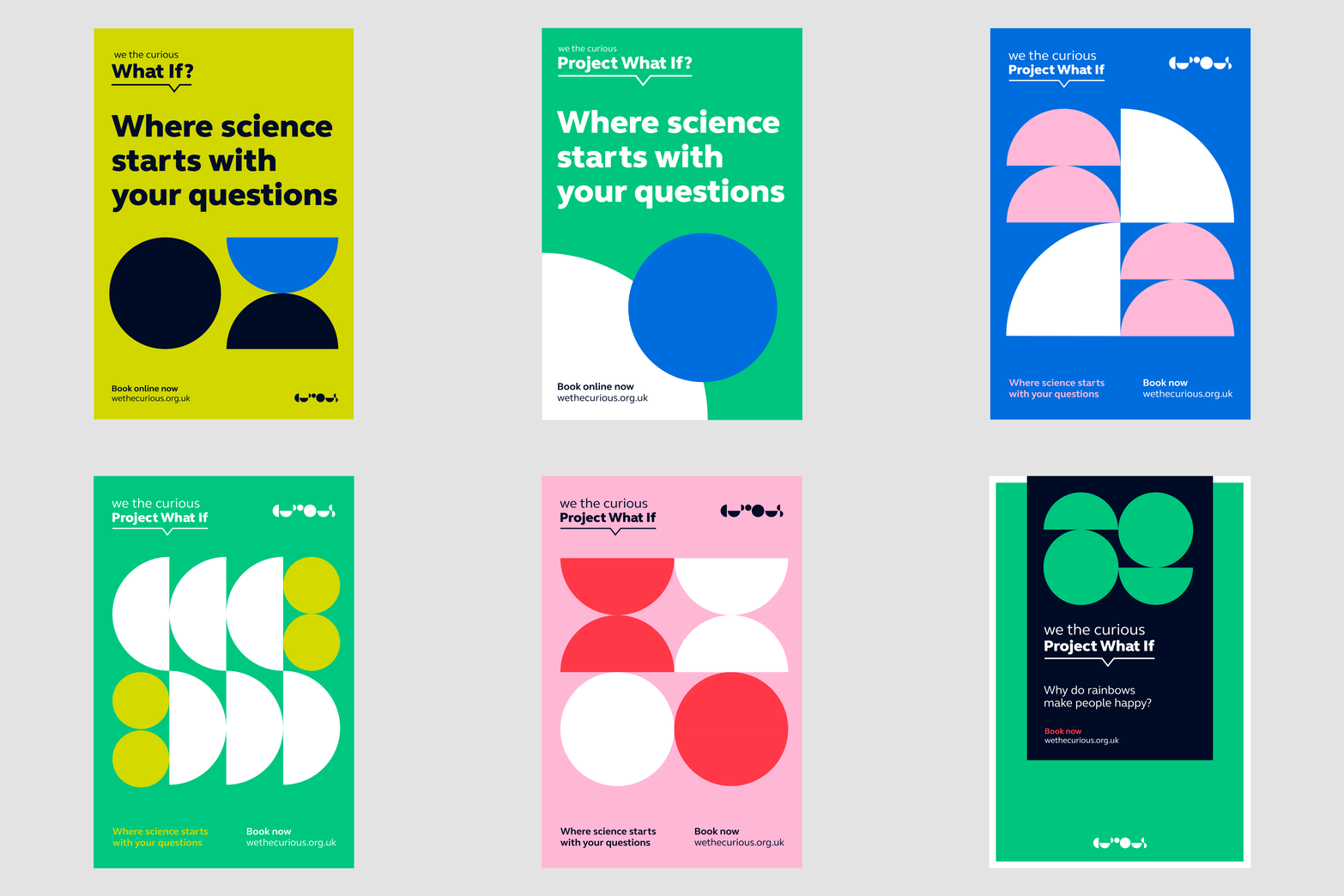
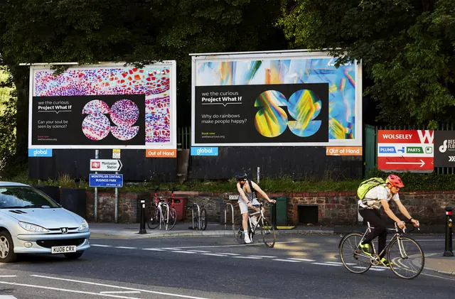
Animated slideshow cycling through the Project What If poster series, each poster a different bright ground with black question copy over half circle and circle compositions.
More like this
See all
Summary
A poster series played back as a slideshow, one portrait poster per frame on a light grey ground, each holding the same layout while the colour and the geometric composition change completely.
Visual description
Every poster is portrait format and centred on a pale grey field. The layout is fixed: a small "we the curious" line sits top left above a heavier "Project What If" with an underline and a downward tick, the We The Curious mark of stacked circle and half circle glyphs sits top right, a large geometric composition occupies the middle two thirds, and two short lines at the foot read "Where science starts with your questions" beside "Book now / wethecurious.org.uk". The variants cycle through an acid yellow poster with a navy circle and a navy half circle over blue, a green poster with a white and blue circle pair under a bold black headline, a blue poster with a two by two block of pink and white half circles, a midnight navy poster with red and white circles and half discs, a green poster with four white half circles and small yellow dots, and a pink poster with red and white halves and full circles. Late in the loop the framing changes: a green poster holds a smaller inset navy poster whose question reads "Why do rainbows make people happy?". Headlines are heavy lowercase and sentence case sans-serif, either black or white depending on the ground, and the foot copy is set small in a contrasting accent. The loop ends on a blank frame before repeating.
Key takeaway
One rigid grid plus a strict kit of circles and half circles produces a series that is obviously the same campaign at a glance while no two posters repeat a composition. Swapping only the ground colour and the shape arrangement keeps production cheap and the wall impact high.
Reuse notes
The reference to reach for when a campaign needs many posters fast, or when a single exhibition has many questions to ask. Requires a very disciplined shape kit and a type hierarchy that survives on both light and dark grounds; the foot copy accent colour is the weak point, since red on green and yellow on green are both close to failing on contrast. Pairs naturally with the matching digital banner formats from the same identity.
More like this


Keep what you find
A free account saves references to boards and can send you a weekly email of picks based on what you save.
To see every result, go Pro.