Preview image. Unlock full-res
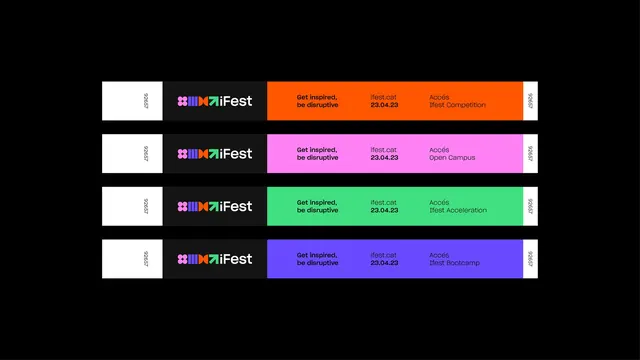
Four horizontal festival wristbands stacked on black, each pairing a black logo panel with a different fluorescent access color.
More like this
See all
Summary
A flat presentation of four event wristbands, identical in structure but color-coded per ticket tier, laid out as evenly spaced horizontal strips on black.
Visual description
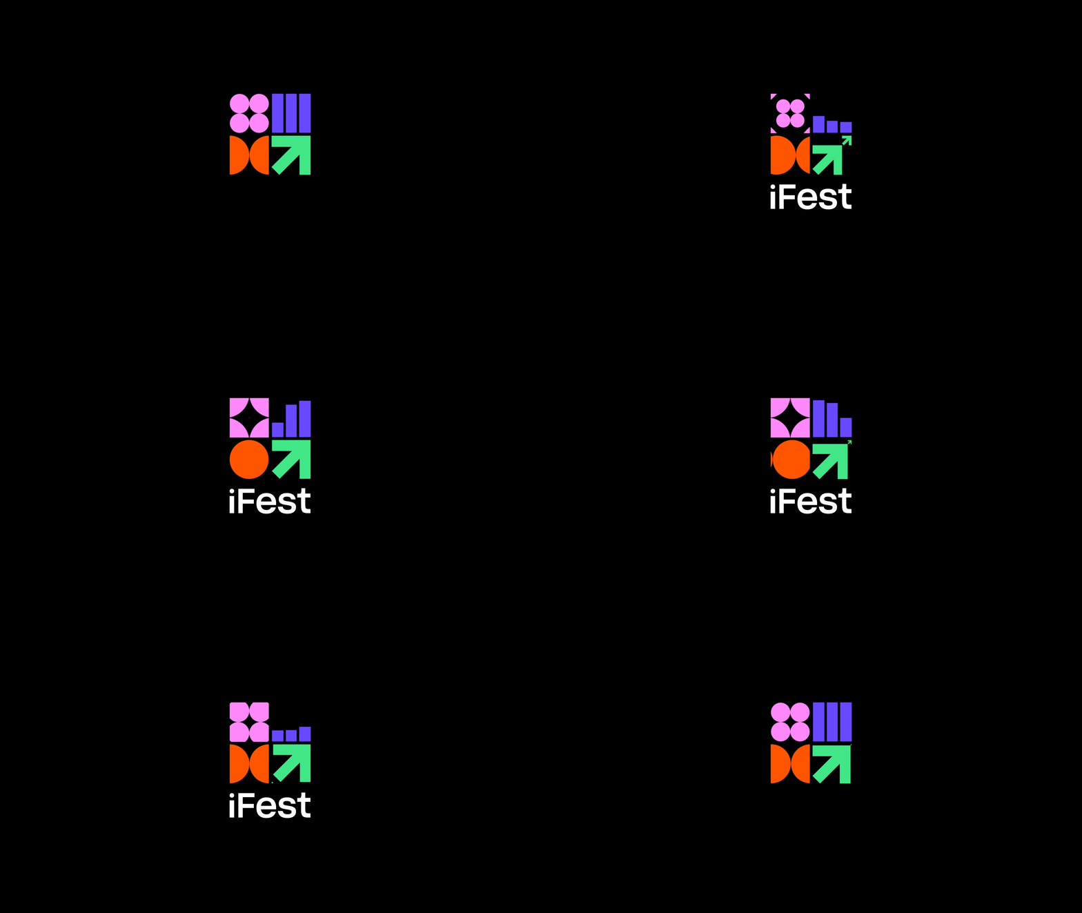
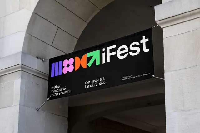
The frame is landscape and solid black, with four long thin bands centered and stacked with equal gaps. Each band is divided into four zones from left to right: a white tab carrying a rotated serial number, a charcoal panel holding the logo, a wide colored field carrying the copy, and a second white tab repeating the serial number. The logo is a horizontal lockup of four colored geometric modules followed by "iFest" in a bold rounded sans: two stacked pink circle pairs, a set of violet horizontal bars, an orange hourglass of opposed half-discs, and a green diagonal arrow. Within the colored field, three copy blocks sit on a shared baseline: the tagline "Get inspired, be disruptive" in bold, then "ifest.cat" above the bold date "23.04.23", then "Accés" above the tier name. The four tiers are orange for Ifest Competition, pink for Open Campus, green for Ifest Acceleration and violet for Ifest Bootcamp. All type is black on the colored fields and white on the charcoal panel.
Key takeaway
Keeping the entire band layout fixed and changing only the fill color turns one artwork into a legible tier system that staff can read at a glance. Splitting the strip into a neutral logo panel and a loud color panel means the identity never has to compete with the fluorescent palette.
Reuse notes
A clean model for any event credential family, festival, conference or campus program, where several ticket types must share one print run and remain distinguishable at arm's length. The four-color system needs each hue to stay legible with black type, which rules out deeper shades. Works best presented flat on black like this, where the colorways can be compared row by row.
More like this

Keep what you find
A free account saves references to boards and can send you a weekly email of picks based on what you save.
To see every result, go Pro.