Preview image. Unlock full-res
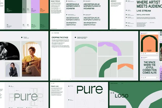
A tilted array of brand-guideline pages covering the color palette, typeface, hierarchy, arch construction rules and logo clear space.
More like this
See all
Summary
Nine or so pages of the Pure brand book arranged as a slightly rotated grid on a deep green field, showing the palette, typography, imagery, shape rules and logo mechanics side by side.
Visual description
The pages are pale grey with green type and are cropped by the frame edges, laid out in three loose rows with thick green gutters. The top row runs a color page with large swatches in green, grey, pink, light green and orange, each annotated with RGB, CMYK and hex values plus tint percentages; a typeface page setting uppercase, lowercase and numerals of a grotesque in regular and condensed cuts across four specimen blocks; and a hierarchy page numbering headline, sub-head, body and detail sizes against live examples reading "WHERE ARTIST MEETS AUDIENCE" and "LIVE STREAM". The middle row shows an imagery page with three artist photographs at different crops and a "Format: Portrait, 9:16" note; a page titled "CROPPING THE STAGE" explaining how the arch shape is enlarged past the format and positioned within thirds, with four diagram panels in mint, lilac, green and orange showing permitted crops; and a strip of social post mockups. The bottom row covers logo clear space with an x-height construction diagram, a primary logo page showing "pure" large with a dotted construction outline beneath, and a green section divider reading "3-8 LOGO".
Key takeaway
The arch is treated as a system component with its own rules page rather than as decoration, which is why it can be blown up, cropped and re-silhouetted across the campaign and still read as the brand. The guideline pages themselves use the same palette and type they document, so the book demonstrates the system while describing it.
Reuse notes
A clean model for a compact brand book: one idea per spread, numbered sections, a diagram panel next to every rule. Useful when documenting a shape-driven identity where the flexible element needs constraints written down. The tilted array presentation is a case-study device, not a page layout, so read the individual pages for the actual grid.
More like this
Keep what you find
A free account saves references to boards and can send you a weekly email of picks based on what you save.
To see every result, go Pro.