Preview image. Unlock full-res
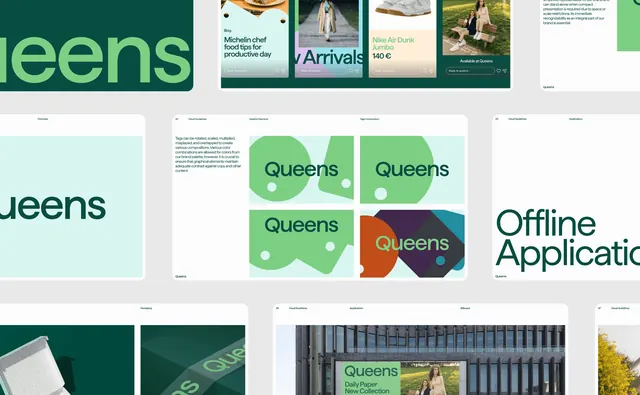
A cropped overhead of Queens guideline spreads arranged in rows, covering the tag graphic element, applications and packaging.
More like this
See all

Summary
A tightly cropped overhead of the Queens brand guidelines, showing several landscape spreads tiled in three rows so the system's rules and its applications sit next to each other.
Visual description
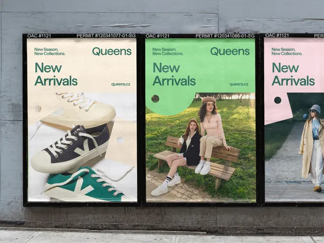
Rounded-corner white and colored spreads are laid on a light grey ground and cropped at every edge. The top row runs a dark green panel with the wordmark bleeding off left, a strip of four social or blog cards in different pastel grounds with "Reply to queens..." fields, and a text spread about simplified logo use. The middle row shows an Overview page in pale mint with the wordmark part-cropped, then page 22, "Visual Guidelines / Graphic Elements / Tags Composition", where a left column of body copy explains that tags may be rotated, scaled, multiplied, misplaced and overlapped, next to a 2x2 grid of green tag shapes carrying the wordmark plus a punched circle, the last cell mixing an orange circle, a dark purple slab and a teal wedge. Page 33 at right is a divider reading "Offline Applications" in large green type. The bottom row shows a Packaging spread with a shoebox and a green tissue or tape detail, then a Billboard application on page 36 with a green panel over a building facade, and page 47 opening onto a photograph. Every page runs a hairline header with section labels and a small Queens footer.
Key takeaway
Sitting the rule page directly beside the application page, so the tag composition grid and the billboard that uses it share a row, is what makes a guideline document look usable rather than decorative. The 2x2 sample grid that deliberately includes an off-palette purple and teal cell shows the permitted edge of the system instead of only its best case.
Reuse notes
A good structural reference for laying out a brand-guidelines document that has to cover a single graphic element in depth. The crop here loses page edges, so read it for structure and hierarchy rather than exact margins. Pairs with the wordmark and application frames from the same identity.
More like this



Keep what you find
A free account saves references to boards and can send you a weekly email of picks based on what you save.
To see every result, go Pro.