Preview image. Unlock full-res
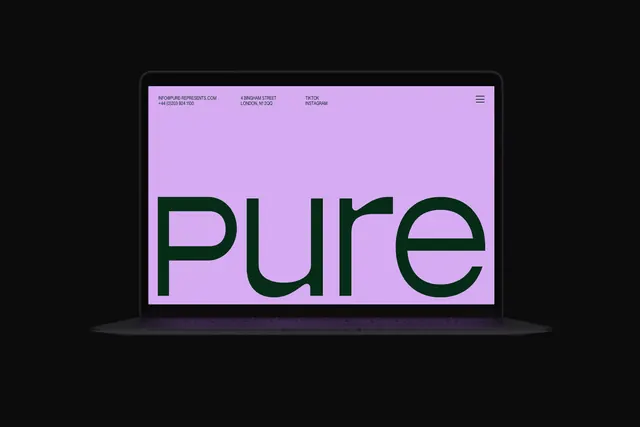
A laptop mockup on black showing a lilac homepage with the lowercase green wordmark scaled to fill the viewport.
More like this
See all
Summary
An open laptop floating on a black background, its screen given over almost entirely to the word "pure" set in deep green on flat lilac.
Visual description
The device sits centred with a soft reflection under the base and no other props. The screen is a single flat lilac field with no imagery. A thin header row of small all-caps green type runs across the top in three columns: an email address and phone number, a street address in London, and two social labels, with a three-line hamburger icon at the far right. The wordmark then occupies the entire lower two thirds, set in a geometric lowercase sans at a size that pushes the p descender toward the bottom edge and the e almost to the right margin. Letter spacing is tight and the strokes are even weight, with a flat horizontal terminal on the e. Nothing else appears on the page: no navigation labels, no hero image, no scroll cue.
Key takeaway
A homepage that is confident enough to be one word and a contact row. Setting the wordmark at viewport scale turns the logo into the layout, and pushing all the utility content into a single small header line makes the restraint feel deliberate rather than unfinished.
Reuse notes
Reach for this when a brand's name is the whole proposition, typically agencies, studios and representation businesses whose audience already knows who they are. It needs a wordmark that can survive extreme scale, and it puts all the burden of navigation on the hidden menu, so it is a poor fit for anything with a deep content architecture.
More like this


Keep what you find
A free account saves references to boards and can send you a weekly email of picks based on what you save.
To see every result, go Pro.