Preview image. Unlock full-res
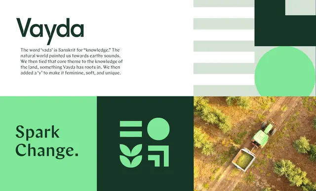
Four-panel brand overview for Vayda combining the wordmark and naming rationale, a striped pattern block, the "Spark Change." line, the icon mark and an aerial farm photograph.
More like this
See all
Summary
A single composed board that shows the whole Vayda system at once: logotype, naming story, pattern, tagline, symbol and photography, tiled into unequal rectangles.
Visual description
The upper left panel is white and carries the dark green geometric sans wordmark at large size with a short serif paragraph below explaining that "vada" is Sanskrit for knowledge and that a "y" was added to soften the name. The upper right panel holds a pattern of evenly spaced pale green horizontal bars, a solid dark green square notched at its top right corner, and a large mid green circle that bleeds off the bottom edge. The lower band splits into three: a light green panel with "Spark Change." in dark green geometric sans across two lines, a dark green panel centring the mint icon, and an aerial photograph of a green tractor towing a loaded trailer between rows of trees on red brown soil. The icon is a 2x2 arrangement of two stacked bars, a filled circle, a two-leaf sprout and a hollow angled corner shape.
Key takeaway
Building a whole identity board from one restricted green scale plus a single white, so pattern, symbol, type and photography all read as one material. The icon repeats the panel logic of the board itself, four cells in a square.
Reuse notes
A strong template for a case study opening frame or a one-page brand summary where each element needs its own compartment. Depends on photography that already sits in the palette; a photo with competing colour would break the scheme. The dark and mint pairing needs contrast checking when used for body text rather than large shapes.
More like this





Keep what you find
A free account saves references to boards and can send you a weekly email of picks based on what you save.
To see every result, go Pro.