
Preview image. Unlock full-res
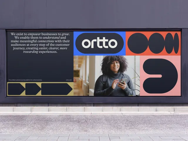
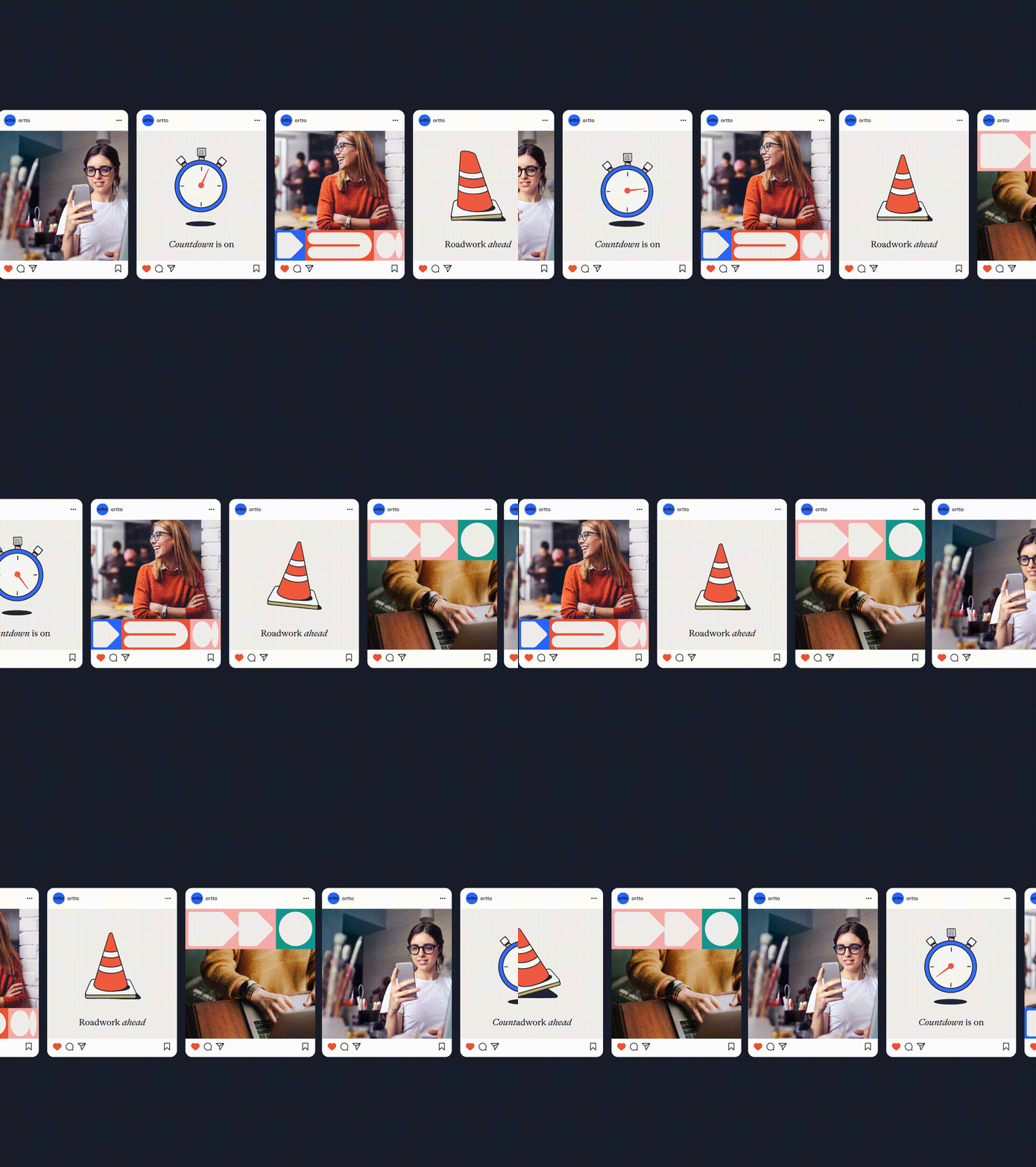
Animated scroll down the Ortto brand toolkit, moving from the shape language and journey path system through type specimens, a brand statement page and the colour palette.
More like this
See all

Summary
A vertical scroll through consecutive pages of a brand toolkit document, showing the identity as a system rather than as a single mark: shape modules, type specimens, a statement page and the full colour palette.
Visual description
Every page sits on the same warm off white with a thin hairline rule under a running header labelled "Brand Toolkit" on the left and the section name on the right. The first pages show a "Journey Path" strip, a long horizontal band split into coloured cells in blue, red, pink, teal and khaki, each cell holding arrowheads, pills, circles and half circles, with the black on red "ortto" pill lockup embedded near the left. Below it the same modules are ranked in rows labelled small, medium and large, so the system is shown at several weights. The scroll then reaches a typography page with "Centra No.1" set very large in black as the headline face over its full alphabet and numerals, then Romek Regular and Romek Regular Italic in a serif, then Neue Haas Grotesk Roman and Medium as body settings. Next a full bleed electric blue page carries "Marketing made remarkable" in large black sans over a paragraph in serif where words like empower, grow, understand, easier and clearer are set in italic for emphasis. The scroll ends on colour pages, first large blocks of blue and red, then a labelled swatch grid naming Blue, Red, Pink, Khaki, Teal, Cream and Midnight with specification text under each, and finally a loose grid of workplace photography of people at laptops and in meetings.
Key takeaway
Presenting the shape language as ranked size tiers before showing it in use makes the system legible as rules, not decoration. The blue statement page shows the emphasis trick that carries the whole identity: geometric sans headline with a serif italic picking out the verbs.
Reuse notes
Reach for this as a reference when packaging an identity into a shareable toolkit document or a scrolling brand site, especially for a B2B software brand that needs a warm neutral base under bright accents. The hairline running header and consistent page furniture are what make the scroll read as one document, so copy that discipline before copying the palette.
More like this
Keep what you find
A free account saves references to boards and can send you a weekly email of picks based on what you save.
To see every result, go Pro.