Preview image. Unlock full-res
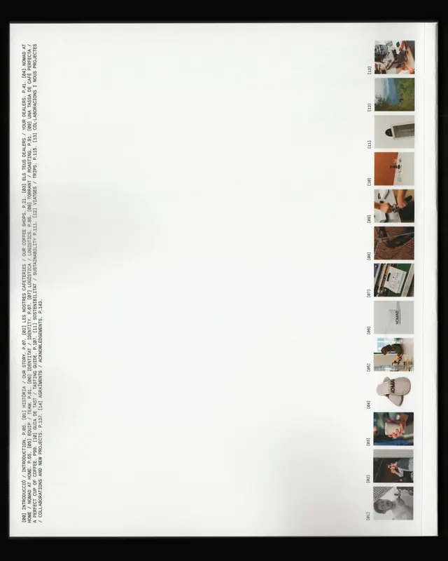
Printed editorial or magazine layout featuring a vertical text column on the left and a grid of small photo thumbnails on the right, with numbered frames.

Summary
A printed editorial page layout combining running body text in a left vertical column with a grid of small numbered photograph thumbnails arranged vertically on the right side.
Visual description
The layout uses a split-column approach with generous white space. The left column contains justified body text in a small sans-serif typeface, all in caps, running vertically down the page. The right side displays a series of small, uniformly sized photograph thumbnails arranged in a single column, each numbered sequentially. The overall page is predominantly white with dark text and image borders creating a clean, organized information hierarchy. The proportions emphasize readability and restrained visual density.
Key takeaway
The discipline of aligning photography as a secondary system beside text creates visual rhythm. The numbered sequencing suggests a narrative or editorial framework that pairs thoughtful typography with visual documentation. The two-column split allows readers to engage with either layer independently.
Reuse notes
Strong reference for editorial design, portfolio layouts, or photo essays. The two-column approach works well for pairing narrative text with sequential imagery. Effective for print layouts requiring both substantial written content and visual documentation. Particularly useful for magazine spreads, lookbooks, or artist portfolios where equal weight is given to words and images.
More like this






Keep what you find
A free account saves references to boards and can send you a weekly email of picks based on what you save.
To see every result, go Pro.