Preview image. Unlock full-res
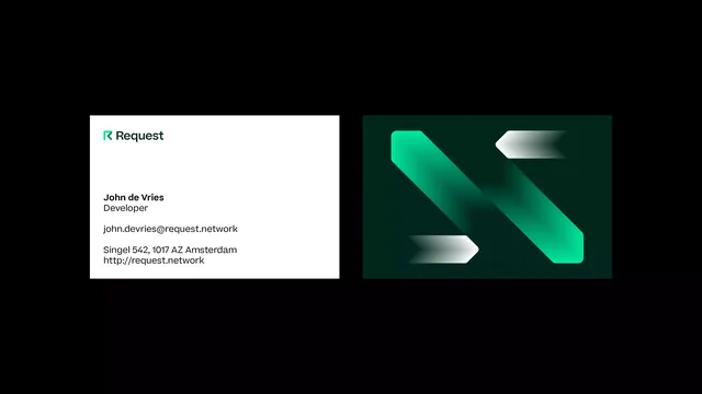
A white business card with a green R mark and clean contact hierarchy, paired with a dark green back carrying an oversized gradient chevron composition.
More like this
See all

Summary
Two business cards floating on pure black, showing an ordered white information face next to a dark green face given over entirely to an enlarged crop of the brand's chevron graphic.
Visual description
The left card is white. Top left sits the lockup: a green R built from a solid angled stem and a chevron-like notch, followed by "Request" in a geometric sans with a distinctive single-storey construction. A wide empty gap separates the lockup from the details, which run in three left-aligned groups: "John de Vries" in semibold with "Developer" beneath, then john.devries@request.network, then Singel 542, 1017 AZ Amsterdam and http://request.network. Everything is set in one face at one size with weight as the only hierarchy cue.
The right card is a very dark green field carrying four angled forms. Two broad diagonal bars run top left to bottom right, each fading from saturated green at one end to near transparent at the other, and each finished with a chevron notch. Two smaller arrow shapes, one pointing left at the top right and one pointing right at the lower left, are filled with white to grey gradients. The shapes interlock into a rough letterform, cropped tightly enough that they read as pattern. Both cards cast no shadow on the black ground.
Key takeaway
Splitting the card into a completely quiet face and a completely graphic face means the mark never has to compete with the address. Rebuilding the logo's chevron at ten times scale, cropped past legibility, is a cheap way to generate a back-of-card graphic that still belongs to the identity.
Reuse notes
Well suited to fintech, payments and infrastructure brands that need to look precise rather than expressive. The gradient face relies on a deep, nearly black substrate to keep the fades smooth, so it will band badly on uncoated stock. Weight-only hierarchy on the front means the copy must be short.
More like this


Keep what you find
A free account saves references to boards and can send you a weekly email of picks based on what you save.
To see every result, go Pro.