Preview image. Unlock full-res
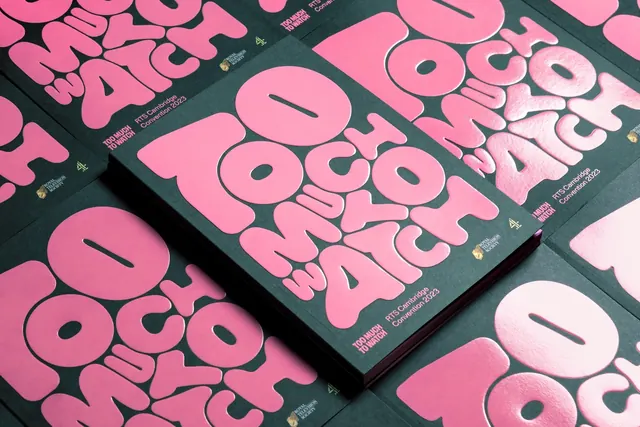
Printed programme covers laid out in a tight grid, one copy raised on top, each showing the bubble lettering in glossy pink on uncoated dark green stock.
More like this
See all


Summary
Programme covers arranged as a flat tiled field with one copy sitting proud of the grid, the pink lettering catching light so its glossy finish separates from the matte green board.
Visual description
Shot from a low oblique angle. Several identical covers are butted together in a loose grid across the whole frame, all printed dark bottle green with the phrase in pink rounded letters that nest and interlock, letters mirrored and rotated so the reading order zigzags. One thick copy sits on top at centre, its spine and page block visible along the right edge, casting a shadow onto the sheets below. Raking light from the upper right makes the pink shift from deep rose in shadow to near-white where the varnish catches, revealing that the letters are printed with a gloss finish over an uncoated matte green. Each cover carries the same footer set: a two-line all-caps title, the event name and year in a light sans-serif beside it, then the Royal Television Society crest in gold and the broadcaster mark in green at the outer edge.
Key takeaway
The glossy spot finish over matte stock is the whole trick; it makes a two-colour cover read as three because the light does the rest. Tiling many copies and lifting one shows both the pattern and the object in a single shot.
Reuse notes
Reach for this when photographing print collateral where the finish is the selling point, and for cover systems that need to look good stacked on a registration table. The interlocking lettering makes the title slow to read, so pair it with a plain footer that states the event plainly.