Preview image. Unlock full-res
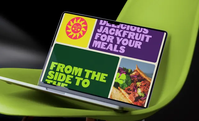
A laptop propped on a lime chair showing the Main website as a four-panel bento grid of yellow, purple, dark green and a food photograph.
More like this
See all
Summary
The brand carried onto a website homepage built as four rounded colour blocks, shot on a laptop resting at an angle on a lime moulded chair.
Visual description
The laptop is photographed from the front left so the screen skews across the frame, its lid resting against the curved back of a bright lime chair against a black background. On screen, four generously rounded panels sit on a pale cream gutter. Top left is a yellow tile holding the pink sun icon with its smiling face. Top right is a deep purple tile with lilac heavy all-caps type reading "DELICIOUS JACKFRUIT FOR YOUR MEALS", the first line cropped by the top edge of the panel. Bottom left is a dark forest green tile with acid lime all-caps "FROM THE SIDE TO THE" running off the bottom edge mid-word. Bottom right is a photograph of loaded tacos with pulled jackfruit, red cabbage and herbs, with a lime graphic shape overlapping its left edge. The type is set very tight and deliberately overflows its containers.
Key takeaway
Letting the headline type overflow the tile it sits in, top and bottom, makes a static bento grid feel like a moving surface. Using one panel purely for the icon and one purely for food gives the layout a rhythm without any decorative filler.
Reuse notes
Good for consumer food or drink homepages that need appetite appeal and personality above the fold. The cropped type is a deliberate device and needs the full phrase repeated elsewhere so nothing is actually lost. Works only with a palette of three or more full-strength colours that can each hold a panel.