Preview image. Unlock full-res
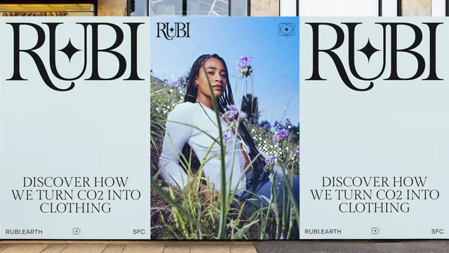
Three-panel storefront hoarding pairing two pale blue typographic posters carrying an oversized Rubi logotype with a central portrait poster shot in a wildflower meadow.
More like this
See all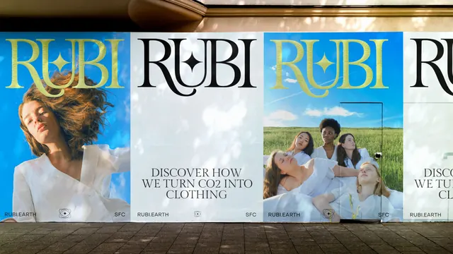
Summary
A three-panel poster wall pasted across a shopfront, alternating two identical pale blue typographic panels with a full-bleed portrait, held together by the same logotype, footer bar and star glyph.
Visual description
The outer two panels share a very pale blue-grey ground. Each is topped by the RUBI logotype at enormous scale in near-black, a high-contrast serif whose R and B carry swelling bowls and whose U holds a four-point star in its counter, the letters tightly kerned so the word reads as one connected shape. The lower third of each panel carries three centred lines of all-caps serif copy, DISCOVER HOW / WE TURN CO2 INTO / CLOTHING, at a fraction of the logotype size. A hairline footer sits at the very bottom with RUBI.EARTH at left, the star glyph centred and SFC at right. The centre panel is a photograph of a young woman with long braids in a fine white knit top, seated low in a meadow of tall grass and small purple and white blooms under a clear blue sky, with blades of grass crossing the foreground and slight grain in the image. Its logotype is reduced and moved to the top left, balanced by the star mark in a circular badge at top right, and the same footer repeats along the bottom edge. Grey pavement runs across the base of the frame and dark shop glazing shows above the panels.
Key takeaway
The same three fixed anchors (logotype, footer bar, star badge) are re-scaled and repositioned rather than redrawn, so a text panel and a photo panel read as one system while looking nothing alike. Repeating the type panel on both sides of the image turns a plain hoarding into a deliberate triptych.
Reuse notes
Useful when a campaign needs to carry a plain-language claim and a lifestyle image in the same run of panels, and as a model for how an editorial serif can be pushed to poster scale without added ornament. The wide type panel depends on the headline staying to three short lines; longer copy would collapse the proportion between logotype and message.