Preview image. Unlock full-res
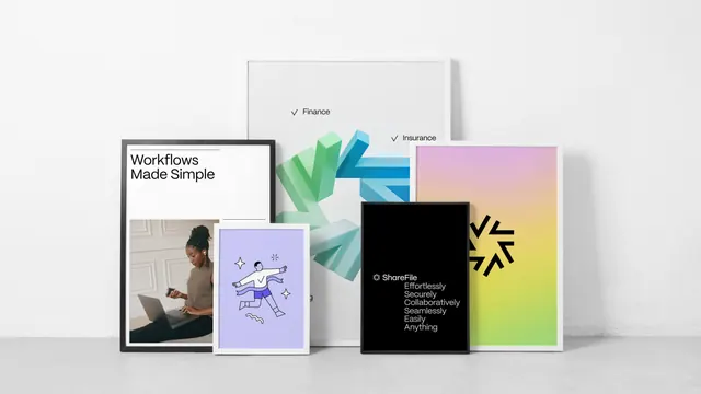
A cluster of overlapping framed posters showing the ShareFile system in one shot, spanning photography, spot illustration, a 3D chevron form, a gradient logo panel and a black type-only sheet.
More like this
See all
Summary
Five framed posters propped against a white wall and overlapped so the whole brand range reads in a single frame, from photography through illustration to pure typography.
Visual description
The posters lean on a pale grey floor against an off-white wall, staggered in depth. Behind everything is a tall white-framed sheet carrying a checkbox list in light sans, with ticked lines reading Finance and Insurance and further items hidden by the posters in front; a 3D sculpture of interlocking chevrons in mint, teal and cobalt sits on it and appears to break past its own frame. Front left, a black-framed poster splits into a white upper band with Workflows Made Simple in two lines of black sans above a hairline, and a photograph below of a woman in a brown top working on a laptop against a panelled wall. Overlapping it, a smaller white-framed poster on a pale lilac ground holds a line drawing of a figure mid-leap with limbs flung out, a small squiggle and two four-point sparkles, the figure filled in navy and white. Centre right, a black-framed black poster carries the ShareFile lockup at the top, the asterisk mark beside the wordmark, and six stacked lines in white sans reading Effortlessly, Securely, Collaboratively, Seamlessly, Easily, Anything. At the right, a gold-framed poster runs a smooth gradient from pink at the top through lilac to lime at the bottom, with the black asterisk mark placed slightly above centre and cropped by the frame edge. The lighting is flat and even and the wall is left completely bare.
Key takeaway
Staging the whole system as one leaning stack proves range and consistency faster than a grid of separate mockups would, and the shared black sans plus the recurring asterisk hold five very different visual registers together. Letting the 3D form and the gradient mark break their own frame edges keeps the arrangement from reading as a catalogue.
Reuse notes
A strong layout for a case-study hero or a brand-guidelines cover where the point is breadth. It needs at least four genuinely different asset types to justify itself, and the overlapping means the rearmost poster is always partly unreadable, so nothing essential should live there.
More like this


Keep what you find
A free account saves references to boards and can send you a weekly email of picks based on what you save.
To see every result, go Pro.