Preview image. Unlock full-res
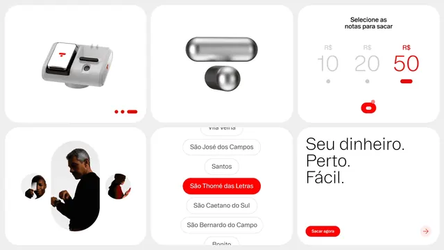
Six rounded white cards on light grey showing the app's withdrawal flow, chrome objects and headline styling as one identity board.
More like this
See all
Summary
A six-card board on pale grey that lays the system out side by side: product renders, interface states, imagery treatment and headline typography in one view.
Visual description
Six large white cards with generous corner radii sit in two rows of three on a light grey ground. Top left, a floating 3D render of a pale card-reader device with a red mark on its screen, and a small red progress indicator of two dots and a bar beneath it. Top centre, two polished chrome objects, a horizontal capsule and a short cylinder, restating the logo geometry. Top right, a denomination picker headed "Selecione as notas para sacar" with "R$ 10", "R$ 20" and "R$ 50" in large light numerals, the 50 active in red with a red bar under it and a red toggle below. Bottom left, a man in black checking his watch inside a tall arch mask, flanked by two small circular crops of other people. Bottom centre, a scrolling city list of rounded outline pills with "São Thomé das Letras" selected in solid red. Bottom right, "Seu dinheiro. / Perto. / Fácil." in large light black type above a red "Sacar agora" pill and a circular arrow button.
Key takeaway
One radius language runs from the cards to the buttons to the chrome objects to the photo masks, so hardware, interface and imagery obviously belong to each other. Red is rationed to the single active state in every card.
Reuse notes
A useful format for presenting a digital identity in one slide instead of a screen parade, and a good reference for selection states in a money app. The board reads well at large sizes only, since several cards depend on small interface labels.
More like this
Keep what you find
A free account saves references to boards and can send you a weekly email of picks based on what you save.
To see every result, go Pro.