Preview image. Unlock full-res
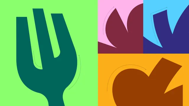
Four panel study of the fork mark cropped to extreme scale, each panel a different two color brand pairing with dotted curve annotations.
More like this
See all


Summary
A four panel composition that crops the fork mark down to its curves so each fragment reads as an abstract shape, shown in four different two color pairings.
Visual description
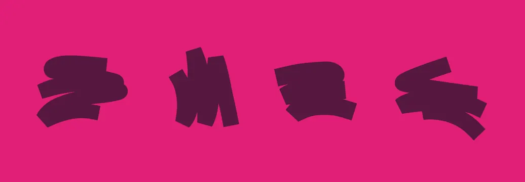
The frame is split into a large left half and three smaller panels on the right. The left panel is bright green with the fork mark in dark teal cropped so the three tines and the swelling bowl of the shape fill the panel and the stem runs off the bottom edge. Each panel carries a thin dotted line ending in a small arrow head that traces one of the mark's curves, reading as a construction annotation. Top right is pink with a maroon fragment showing two tine tips. Middle right is sky blue with a deep indigo fragment. Bottom right is amber with a burnt orange fragment rotated so the shape reads as a leaf or a flame rather than cutlery. No type appears anywhere in the frame.
Key takeaway
Cropping a logomark past the point of recognition turns it into a reusable graphic device, and the dotted curve arrows keep the whole set legible as one system rather than four unrelated abstractions.
Reuse notes
Useful for brand guideline pages and campaign backgrounds where you need pattern material derived from the mark itself rather than a separate texture. Only works with a mark that has strong distinct curves; a geometric or type led logo would produce dull crops. The color pairs need equal weight or one panel will dominate.
More like this


Keep what you find
A free account saves references to boards and can send you a weekly email of picks based on what you save.
To see every result, go Pro.