Preview image. Unlock full-res
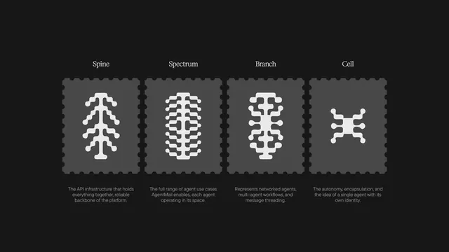
A brand identity exploration for AgentMail featuring an embossed logo mark system with four organic symbol variants across dark UI cards, landing pages, and printed protocol sheets.
More like this
See all


Summary
A brand identity exploration for AgentMail featuring an embossed logo mark system with four organic symbol variants across dark UI cards, landing pages, and printed protocol sheets.
Visual description
Four white embossed logo symbols arranged horizontally on a dark background, each mounted on a dark gray perforated-edge card. Labels above identify them as Spine, Spectrum, Branch, and Cell, representing different aspects of the AgentMail platform infrastructure. Explanatory text below each symbol describes its role in gray serif type, while the logo marks themselves use clean geometric circles and lines to suggest network nodes and connections.
Key takeaway
Pair abstract symbol systems with descriptive labels and brief explanatory text to establish a visual language that educates viewers about product architecture and capability tiers.
Reuse notes
Reach for this as a identity system reference. Pairs with minimal, soft ui directions. Original by Ayush Soni.
More like this






Keep what you find
A free account saves references to boards and can send you a weekly email of picks based on what you save.
To see every result, go Pro.