Preview image. Unlock full-res
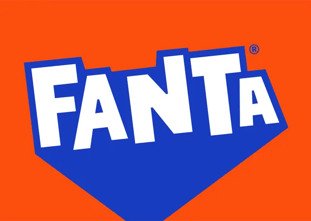
The Fanta wordmark shown large and alone, white cut-out letters knocked out of a blue splash shape on flat orange.
More like this
See all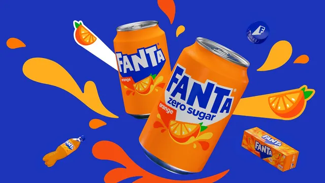

Summary
A hero shot of the Fanta wordmark: white paper-cut capitals knocked out of a blue shape that comes to a point at the bottom, all on a flat orange field.
Visual description
The frame is filled with saturated orange. Centered and tilted slightly, a deep blue shape holds the word FANTA in white. The letters are heavy display capitals with straight, faceted edges and uneven baselines, as if torn or cut by hand, and the final A is set noticeably smaller and lower than the rest. The blue container follows the ragged silhouette of the letters along the top, then drops away below them into a broad chevron that comes to a single point at the bottom, so the mark reads as a downward splash or an arrowhead. A small blue registered trademark symbol sits in the top right, outside the blue field and directly on the orange.
Key takeaway
Letting the containing shape hug the ragged tops of the letters and then resolve into one clean point below gives a rough, hand-cut wordmark a decisive silhouette. The undersized final A is the detail that keeps the lockup from feeling mechanical.
Reuse notes
A model for a mass-market consumer wordmark that has to survive on a can, a bottle and a billboard at very different sizes. The knock-out construction means it only works on two flat colors; over photography the white letters would need a different treatment.