Preview image. Unlock full-res
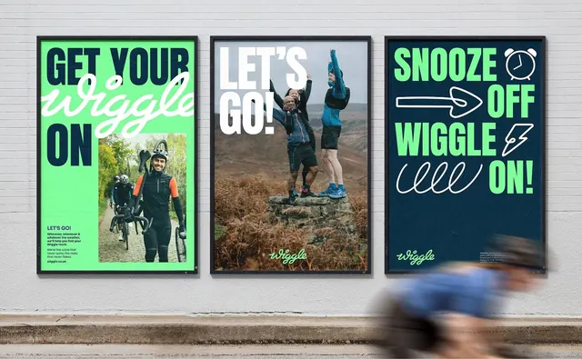
Street mockup of three framed campaign posters mixing acid-green, navy and photography, shot with a blurred cyclist passing in front.
More like this
See all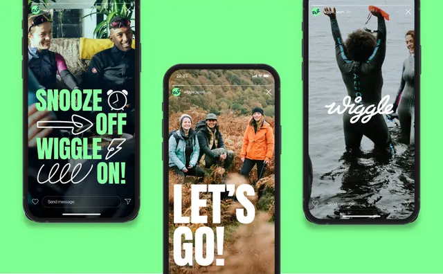
Summary
Three portrait posters hung side by side on a painted brick wall, each running the same campaign line in a different colourway, with a cyclist blurred across the bottom right of the shot.
Visual description
A whitewashed brick wall with a concrete kerb below. Three black-framed posters sit in a row at equal spacing. The left poster is acid green: "GET YOUR" and "ON" in heavy navy condensed caps, with "wiggle" set as a large white brush script overlapping the caps, and a photo of a cyclist walking a gravel bike inset in the lower right; a small navy body-copy block sits bottom left with a url. The centre poster is a full-bleed photograph of three people cheering on a moorland outcrop, overprinted with "LET'S GO!" in white condensed caps and the script logotype small and centred at the foot. The right poster is navy: "SNOOZE OFF WIGGLE ON!" in alternating green and white condensed caps, broken up by white line-drawn doodles of an alarm clock, an arrow, a lightning bolt and a loop squiggle, with the green script logotype bottom left and a tiny body block bottom right. Across the lower right of the photograph, a cyclist in blue streaks past in heavy motion blur.
Key takeaway
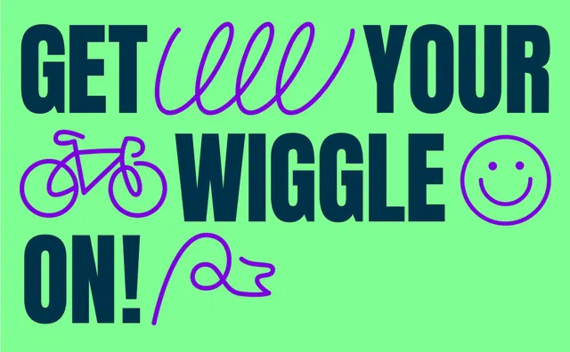
One campaign line held across three posters while the colourway, the image policy and the type-to-script ratio all change is what makes the suite read as a system instead of three layouts. The line doodles are used as punctuation inside the headline, taking the place of words rather than sitting as decoration. Photographing the set with a blurred rider in frame sells the context without adding a single graphic element.
Reuse notes
A good reference for presenting a campaign as a run of three rather than a hero poster, especially for active or retail brands where energy matters more than polish. The condensed-caps plus brush-script pairing needs the script to sit noticeably larger and overlap the caps, or it reads as an afterthought. The inset photo on the green poster is the weakest of the three; the full-bleed centre panel carries the group.