Preview image. Unlock full-res
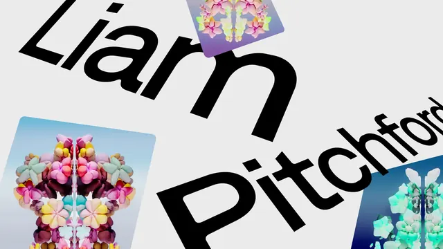
Off-grey composition tilting an artist name in oversized black sans across the frame while rounded cards of mirrored 3D floral renders float over it.
More like this
See all
Summary
An artist name set enormous in black sans, rotated on a diagonal and running off the right and bottom edges, with three rounded-corner cards of mirrored 3D flower renders layered over and under the letterforms.
Visual description
The ground is a flat off-white grey. "Liam" runs across the top left on a downward diagonal in a heavy geometric sans, black, sitting whole inside the frame with only a thin margin left of the L. "Pitchford" repeats the same angle below and to the right, losing its final letter past the right edge and letting its P run off the bottom. Three rounded-corner cards sit at the same rotation: top centre, a small card of pale pink and lilac blossoms mirrored down a vertical axis over a violet gradient; lower left, a much larger card showing a symmetrical bouquet of glossy inflated-looking flowers in pink, cream, teal and burgundy against a pale blue sky; lower right, a partly cropped card of the same mirrored arrangement in mint and white against deep navy. The cards pass in front of some letters and behind others. Nothing is horizontal; every element shares one rotation angle.
Key takeaway
Locking the type and every image card to a single shared rotation is what keeps an aggressively skewed layout coherent rather than chaotic. Letting the surname run off the edge assumes the audience already knows it, which is a confidence move that buys the type enough scale to become the composition. Alternating which cards sit above and below the letterforms creates depth without any shadow or blur.
Reuse notes
Good for artist, speaker or drop announcements where a single name has to carry the frame and the work itself can appear as thumbnails. The layout needs imagery with its own internal symmetry to survive being reduced to small tilted cards. Avoid it where the name must be legible to a first-time reader, since the crop sacrifices readability for scale.
More like this
Keep what you find
A free account saves references to boards and can send you a weekly email of picks based on what you save.
To see every result, go Pro.