Preview image. Unlock full-res
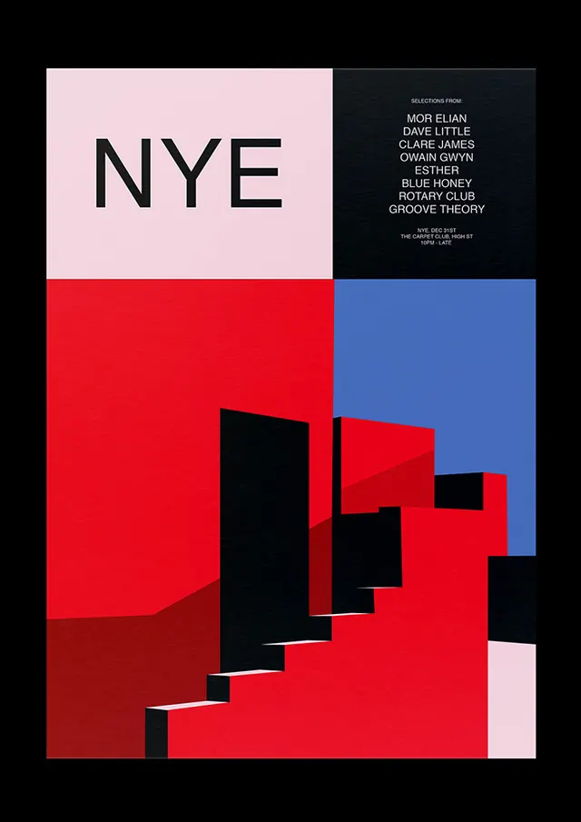
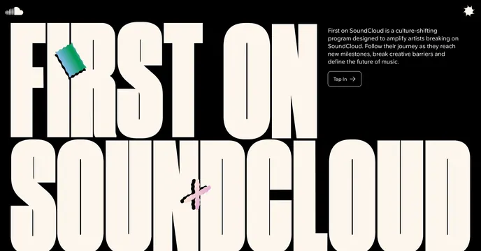
A comprehensive brand identity system documentation featuring geometric shapes, a cohesive color palette, and systematic design approach applied across multiple branded materials.
Summary
A systematic brand identity showcasing geometric pattern construction, a bold orange-and-blue color system, and consistent application across brand touchpoints with Swiss design principles.
Visual description
The identity is built on a foundation of geometric shapes—primarily circles, rectangles, and angular cuts—that combine to create a modular pattern system. The primary colors are vibrant orange (#FF6B35) and deep navy blue (#004E89), creating high contrast and visual energy. A clean white/off-white (#F7F7F7) provides breathing room and balance. The system is documented across multiple spreads showing applications: pattern modules, color grids, typography pairings, and branded material applications (business cards, letterhead, packaging). The geometric approach is rigorous and systematic, suggesting a design system built for scalability and consistency. Clean sans-serif typography complements the geometric aesthetic.
Key takeaway
A masterclass in modular identity design. The geometric pattern system can be deconstructed and recombined while maintaining brand coherence. The color palette's boldness and contrast make it memorable while the systematic approach ensures consistency across applications.
Reuse notes
Excellent reference for tech company branding, product design systems, and modern corporate identity. The modular geometric approach is highly adaptable—shapes can be scaled, combined, or simplified for different applications. The color system provides strong brand differentiation in crowded markets. Particularly effective for B2B contexts where professionalism and structure matter. The pattern system can inspire physical product applications (packaging, texture, pattern printing).