Preview image. Unlock full-res
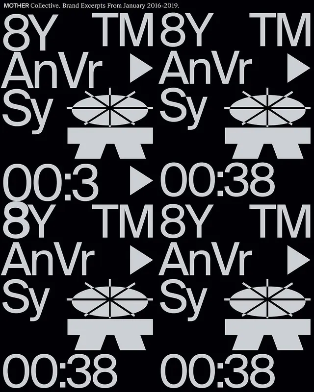
A typographic grid showing variations of abstract geometric symbols with bold sans-serif letterforms and a monochrome palette.

Summary
A systematic exploration of typographic and geometric variations for MOTHER Collective, featuring bold sans-serif capitals paired with abstract geometric shapes in black and gray.
Visual description
A grid layout showing repeated combinations of stylized letterforms and geometric symbols. Each cell contains text reading "8Y TM8Y AnVr" and "Sy" alongside a circular geometric diagram with radiating lines, followed by timecode numbers. The design alternates between black backgrounds and white typography.
Key takeaway
Systematic grid-based brand identity exploration demonstrates how geometric symbols can be paired with typography to create a modular, scalable design language.
Reuse notes
Strong reference for brand system design, particularly for tech or media brands needing a formal, geometric identity. The grid approach is ideal for showing multiple applications and variations.
More like this

Keep what you find
A free account saves references to boards and can send you a weekly email of picks based on what you save.
To see every result, go Pro.