Preview image. Unlock full-res
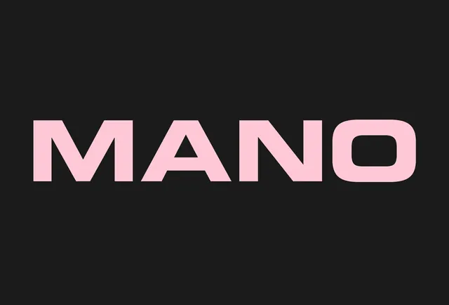
Clean, sans-serif wordmark in pale pink over a dark background, featuring distinctive geometric letterforms with uniform stroke weight.
Summary
A bold, all-caps wordmark "MANO" in pale pink against a near-black background, using a geometric sans-serif typeface with clean, contemporary letterforms.
Visual description
The word "MANO" rendered in oversized, uniform-weight geometric sans-serif type, positioned left-aligned in the upper portion of a dark composition. The pale pink color creates strong contrast against the dark background. The letterforms are clean and legible, with consistent stroke width and minimal ornamentation.
Key takeaway
Effective use of color contrast and simplified geometric letterforms creates a memorable, readable wordmark suitable for food/beverage branding or modern visual identity systems.
Reuse notes
Strong reference for minimal wordmark design, high-contrast typography studies, or contemporary food/restaurant identity systems requiring clean, sophisticated mark-making.
More like this



Keep what you find
A free account saves references to boards and can send you a weekly email of picks based on what you save.
To see every result, go Pro.