Preview image. Unlock full-res
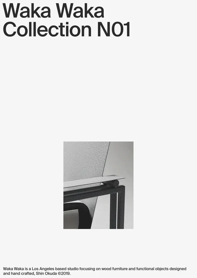
A minimalist publication cover for Waka Waka Collection No1 showcasing a close-up detail photograph of handcrafted wooden furniture joinery against a light grey background.
Summary
A minimalist publication cover for Waka Waka's first furniture collection featuring a bold black title, a centered photograph of furniture joint details, and a descriptive paragraph in small type at the bottom.
Visual description
A light grey background fills most of a vertical composition. Bold black sans-serif type near the top reads "Waka Waka Collection N01" with generous letter-spacing. The middle third contains a small centered square photograph showing the precise joinery detail of wooden furniture, with dark wood and metal frames creating sharp geometric contrast against a neutral background. Below sits a small justified paragraph of grey body text describing the studio as Los Angeles-based and hand-crafted. Ample white space surrounds all elements, creating a gallery-like presentation that emphasizes craftsmanship and restraint.
Key takeaway
Product detail photography as the hero on a minimalist page. The small-scale image forced focus through contrast and isolation. Generous breathing room around typography and imagery conveys confidence and luxury without decoration.
Reuse notes
Excellent reference for furniture, craft, design studio, or luxury goods branding. The publication grid works for print catalogs, lookbooks, or brand guidelines. The monochrome palette and minimal approach feel timeless and sophisticated. The small-scale product detail photograph can be used in digital contexts if cropped tighter or enlarged. Works particularly well for studios emphasizing handcraft and precision. The layout is restrained enough to scale from business cards to large poster formats. Pairing clean sans-serif type with tight product detail photography is a classic approach for high-end functional design.
More like this

Keep what you find
A free account saves references to boards and can send you a weekly email of picks based on what you save.
To see every result, go Pro.